I’ve created a Visual Nutrition Calculator that allows you to visually inspect a restaurant’s menu based on the relative calorie, fat, protein, and carbohydrate values of the food.
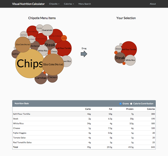
The idea is to give a different view of a restaurant’s menu. Rather than picking your meal based on pictures, or choosing a meal and then seeing how many calories it has, the idea is to find and pick items based on their health characteristics. Additionally, a nutrition table is supplied at the bottom that lets you see the stats of your selected choices. You can even view the percent of calories that come from protein, fat and carbohydrates.
Genesis
The bubble chart idea came from a cool presentation by Jim Vallandingham on D3.js’s force layout. I had been looking for another side project to do with the D3 visualization library, and after playing around with Jim’s example bubble chart, I thought it might be fun to try and make my own. I just needed an idea of something to visualize.
Fast forward a few hours and its dinner time and I’m at chipotle.com. I’m toggling the different selections to see how they effect the output and suddenly it hits me! Nutrition calculators have been around on the web for almost two decades. And sadly, they haven’t really evolved much. You check a few boxes, maybe click on a picture of a hamburger, and then you push a button to see how many calories you’ll be eating. The tools don’t really help you make a healthy choice.
Using a bubble chart, I knew I could make a calculator where you could easily see the health impact of each item. It’d be sort of like WiseGeek’s What Does 200 Calories Look Like, except it’d be of what you’re currently thinking of eating.
I started the project shortly before I posted my entry on visualizing bls.gov data and I was originally going to include a whole host of helpful visual aids. My favorite being a sugar cube visualization that would show you the equivalent amount of sugar cubes you’d be eating (similar to Sugar Stack’s How Much Sugar is in Sodas pictures), but I nixed the ideas in favor of just finishing the main idea – I’m bad about starting projects and then not finishing them. Though I still like the sugar cube idea – I think it’d be a cool addition to nutrition calculators.
The Patent…
So I had just finished writing my nutritional calculator and was working on this blog entry when I discovered something that made my heart sink. It turns out there’s a reason that there hasn’t been a lot of movement in the nutrition calculator area, and that’s because back in 2003 the US government granted someone a patent for “Method and system for computerized visual behavior analysis, training, and planning” that covered most of the base aspects of a nutritional calculator. It’s two major claims being:
- A system of computerized meal planning, comprising:
- A User Interface;
- A Database of food objects organizable into meals; and
- At least one Picture Menus, which displays on the User Interface meals from the Database that a user can select from to meet customized eating goal.
- A system of computerized meal planning, comprising:
- A User Interface;
- A Database of food objects; and
- A Meal Builder, which displays on the User Interface meals from the Database, and wherein a user can change content of said meals and view the resulting meals’ impact on customized eating goals.
I couldn’t believe my eyes. How could something so general be patented? What was the US patent office thinking?!
I googled around and discovered the patent holder had been aggressively going after anyone they felt violated their patent. I went back and studied their patent information and sample images. Only their second claim didn’t involve pictures of the food, and that claim seemed to center around a Meal Builder and “meet[ing] customized eating goal[s]”. According to “summary of the invention” section of the patent, the Meal Builder was based around to picture menus. Looking at their sample images (Fig 9), I noticed they had alerts pop up when food parameters like fiber got too high. I reasoned with myself that nothing about mine used pictures or gave advice about goals in general, so I should be safe. But I still felt uneasy. It wasn’t until I came across some recent news stories that I felt comfortable again.
Bravo Gets the Patent Invalidated
To my relief, one of the companies sued back in 2012 – Bravo – decided to fight back, and in July of this year they got the US District Court for the Southern District of New York to invalidate the patent. Additionally, earlier this month a batch of Texas lawsuits that the patent holder had filed were dismissed due to collateral estoppel. The patent holder plans to appeal the NY ruling, but for now it looks like its safe again create nutrition calculators.
Prior Art?
So near the beginning of this article I mentioned that nutrition calculators had been on the web for almost two decades. Using the Internet Archive, I was able to find one by the Hearst Corporation that existed in 1996. It’s been defunct since early 2007, but finding it took around 10 minutes.
If these types of apps existed in 1996, how was someone able to patent one in 2003? I’m actually not sure – and in a bizarre twist, the patent holder actually filed a lawsuit against the Hearst Corporation over a meal maker that they created for seventeen.com in 2011. The last I could find on the lawsuit was that it was being transferred to the Southern District of New York along with the Bravo case in late 2013. I’d be curious to know if the Hearst Corporation was aware that they had previously created a nutrition calculator back in 1996. Hell, I wonder if anyone involved in any of the cases actually took the time to see if a nutritional calculator existed in the Internet Archive.
Another Patent…
While researching the meal planning patent I also came across another patent that gave me pause. This one involved visual size and nutritional characteristics:
A system is shown to teach individuals the relationship between the visual size and the nutritional characteristics of portions of food by using either a life size image of, or the corporeal finger of the individual as a scale against life size images of different sized portions of different kinds of food, while showing the nutritional characteristics of such portions; and to adjust the relative sizes of portions of food to provide a nutritionally well-balanced meal.
This patent is now expired though, so thankfully there was no need to worry.
Final Thoughts
Even though small projects are unlikely to be the target of patent holders, it sometimes happens. I’m glad Bravo decided to challenge the meal planning patent. It costs them more money than settling*, but it makes things better for the little guy.
I think visualization tools like D3.js could be really useful for nutritional sites. This app is really just sort of a proof of concept / prototype. I made it mostly just for fun to see how it would turn out. However, if I were running an actual nutrition site, I could see all sorts of crazy possibilities for something like this.
* I originally came across the patent when I was using the Jimmy John’s nutrition calculator. The patent information is in small grey text under the “Add to Meal” button.