Updating Layouts: Click Two Keys To Swap Their Positions
Keyboard Layouts 101
This application allows you to analyze and visualize the typing patterns you create when you use different keyboard layouts, such as the
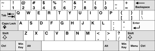
QWERTY,
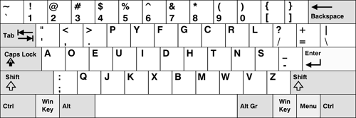
Dvorak, and
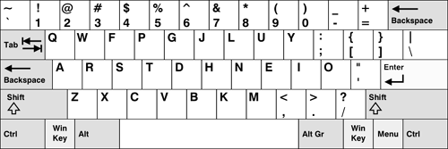
Colemak layouts.
If you have no idea what I'm talking about, the keyboard layout you're currently using isn't the only one that's out there, and not all
keyboard layouts are created equal. Some are better for your wrists and allow you to type faster and with more comfort.
Here are the three most popular keyboard layouts (which I also mentioned above):
 QWERTY
 Dvorak (Simplified)
 Colemak
My interest in keyboard layouts came after I read a Discover magazine article entitled
"The Curse of QWERTY". The article tells the story of the QWERTY and Dvorak keyboard layouts and makes a compelling case for switching from a QWERTY layout to a Dvorak layout. Here is a quick summary of its most important points:
- The QWERTY layout was created in the early 1870's before touch typing and without speed or comfort in mind.
- The Dvorak layout was created in the 1930's and is based on years of research. It takes speed and comfort into account.
- On average, the left hand does 56% of the typing when a QWERTY layout is used. With a Dvorak layout, the right hand does 56% of the typing.
- The Dvorak layout forces you to alternate hands more frequently when typing, this causes you to type faster.
- Users type fastest on the home row. With a QWERTY layout, only 32% of your typing occurs on the home row. With a Dvorak layout, 70% of your typing occurs on the home row.
- It's hypothesized that the Dvorak layout will make it less likely that you'll develop Carpal Tunnel Syndrome (CTS).
- Anecdotally, people who develop carpal tunnel syndrome seem to find relief when they switch from a QWERTY layout to Dvorak layout.
There are more reasons, but those were the ones that stuck with me. I was so convinced by what I read that I switched my work and home keyboard layouts to a Dvorak layout by configuring some Windows XP settings in the control panel (to see how
click here). This lasted for about 6 days (3 of those were over the Labor Day weekend), and then I had to switch back since learning the Dvorak layout was slowing me down at work. I also discovered that the Dvorak layout made all the nice QWERTY keyboard shortcuts (Undo, Cut, Copy and Paste) virtually unusable. This was a big minus since I use those shortcuts constantly. The Dvorak layout also over worked my right pinky. I found myself having to take typing breaks, something I hadn't done since high school.
After talking to someone who had Carpal Tunnel Syndrome (something I'm worried about getting), I learned about yet another improved keyboard
layout that preserved QWERTY's bottom row short cuts and didn't put massive amounts of stress on the right pinky. This layout was known as
the Colemak. Unlike the Dvorak, the Colemak layout is relatively new (developed within the last 5 years), doesn't have a lot of research
behind it, and it doesn't have a very large following (online estimates put the number of users between 650 and 1,300).
However, the layout looks pretty promising.
All of this research is what motivated me to create this application. I wanted to visually compare my typing patterns with the different
layouts and get some stats on what hand and which fingers I was using the most.
Hopefully the user interface and output is straight forward enough. I had a lot of fun writing this application, hopefully some of you out
there will find it useful.


