Input
Configuration
About
Instructions
- Type or paste a sample of text in the text area to the right.
- Press the button below the text area. You will be taken to a page with statistics and visualizations on how various keyboard layouts are suited for handling a user who types that text.
- You can create your own layouts for testing on the "Configuration" tab to the left.
What is this?
This app analyzes your keyboard layout. See the about tab for more info.
Click or Drag Keys
|
|
Number of Layouts to Compare:
Generate Personalized Layout
Generate Personalized Layout
Keyboard Layouts 101
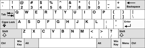
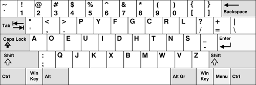
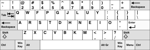
This application allows you to analyze and visualize the typing patterns you create when you use different keyboard layouts, such as the
QWERTY, Dvorak, and
Colemak layouts.
If you have no idea what I'm talking about, the keyboard layout you're currently using isn't the only one that's out there, and not all
keyboard layouts are created equal. Some are better for your wrists and allow you to type faster and with more comfort.
Here are the three most popular keyboard layouts (which I also mentioned above):

QWERTY

Dvorak (Simplified)

Colemak
- The QWERTY layout was created in the early 1870's before touch typing and without speed or comfort in mind.
- The Dvorak layout was created in the 1930's and is based on years of research. It takes speed and comfort into account.
- On average, the left hand does 56% of the typing when a QWERTY layout is used. With a Dvorak layout, the right hand does 56% of the typing.
- The Dvorak layout forces you to alternate hands more frequently when typing, this causes you to type faster.
- Users type fastest on the home row. With a QWERTY layout, only 32% of your typing occurs on the home row. With a Dvorak layout, 70% of your typing occurs on the home row.
- It's hypothesized that the Dvorak layout will make it less likely that you'll develop Carpal Tunnel Syndrome (CTS).
- Anecdotally, people who develop carpal tunnel syndrome seem to find relief when they switch from a QWERTY layout to Dvorak layout.
Summary
Distance
Finger Usage
Row Usage
Heat Map
Miscellaneous
Personalized

|
For in-depth statistics and visualizations, see the tabs on the left!
|
Colemak
Below you can see a table which ranks the input layouts and given them a score between 0 and 100.
The optimal layout score is based on a weighed calculation that factors in the
distance your fingers moved (33%),
how often you use particular fingers (33%),
and how often you switch fingers and hands while typing (34%).
|
?
|
Consecutive Finger Use -
This metric tells you how often the same finger is used to type a key as was used to
type the previous key.
An example of this would be typing "fg" on QWERTY. When looking at "g", the program notes that
the index finger
was also previously used to type "f". The lower the number the better.
Instances of
the same key being pressed twice in a row are
not factored in (example: typing "ff").
Consecutive Hand and Thumb Use
- This metric tells you how often the same hand was
used to type a key as was used to
type the previous key (thumbs are grouped as a separate entity).
An example of this would be typing "af" on QWERTY.
When looking at "f", the program notes that the left hand
was also previously used to type "a".
The lower the number the better.
Instances of
the same key being pressed twice in a row are
not factored in (example: typing "ff").
Modifier Key Use
- This metric tells you how often the Shift, AltGr, and Shift+AltGr modifiers are used with
characters in the text.
Personalized Layout
And now just for fun, here is what the optimal layout of your keyboard would be if it were tailored to
fit the way you type. This personalized layout is based on a frequency analysis of what you typed.
It places your most
commonly typed characters in the most optimal spots and your least typed characters in the least optimal
spots (however, for practical reasons, I have frozen certain keys). The more you type, the more accurate
this layout will be. I should note that the generated design does not take into account how often you
switch hands while typing or how close together common letter pairings are. Most modern layouts take into
account ergonomic considerations as well as key usage.
initially I was going to leave out this feature for version 2.0 of my Analyzer, but I had some requests
to put it back in so I did. Since a complete ergonomic analysis isn't taken into account, the generated
layout should be taken with a grain of salt, but it can give you some ideas of good key placements.