I’ve split my color fading app into two new online apps with interfaces that utilize Yahoo’s YUI. You can see them here:
http://patorjk.com/software/colorfader/
http://patorjk.com/software/gradientimage/
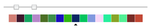
The new designs are meant to be more concise, cleaner, and easier to use. I tried to think up a nice way to let the user manipulate lots of colors without it looking cluttered. The old design had the problem where the input colors were stacked vertically. The more colors one decided to use, the longer the page got. To fix this, I decided upon using a two thumbed slider bar and a horizontal row of colors that would shift depending on what your selection was (see image below). One thumb indicated the number of colors the user wanted to use and the other one indicated which color the user was currently editing.
I thought it was a really clever way of handling the problem, however, after watching a couple of people try to use the app, I realized it wasn’t that intuitive. People kept clicking on the colors they wanted to edit. And when that wouldn’t work, they assumed there was something wrong with the thing (no one bothered to read the instructions). Oh well. I made a modification to it to allow “color clicking” selection to work.
Hopefully this is the last time I do a complete redesign this program(s). I’ve been perpetually annoyed with myself over the past 3 design jobs I’ve done with it. I was actually working on something else for a while, but for some reason I got side tracked, oh well. I think I have programmer ADD sometimes.
Anyway, both redesigns were finished tonight, so there may be a few bugs. Let me know if you have any problems (or suggestions). The widgets I used from the YUI were the two slider bars and the color picker dialog.
Both work well for me. I do like the 2 thumbed slider bar.
-Brian
Cool beans. And good to know someone else likes the slider bar. I had started to wonder if I had gone in the correct direction with that design decision.
I like the slider as well. It’s an interesting layout for the application.
Two votes now. Now it’s neck and neck with the people who were confused. Thanks for the feed back.
I’m positive the number of people who would find the interface to be intuitive would greatly outweigh the number of those who are confused by the application once it begins to get more traffic. It’s time to invest some effort in a minimalistic advertising approach such as using the fader on other forums and things, and dropping a subtle link.
I need to do some kind of advertising/promotion of some kind, I’m just kind of clueless as to how to do it at the moment. I used to be more active on other message boards, but as of recently I’ve just been lurking around certain places and I wouldn’t want to come off as trying to spam any particular board, so I’d have to be careful in how I did any kind of promotion.
I should do something though. Just posting stuff up here and hoping that people find it really isn’t the best idea.
I don’t use any type of advertisements on my own site, or anything I could profit off of such as Google AdSense, but in the next revision of my website’s layout I’m going to try and focus on Search Engine Optimization. At one point my domain was getting gigabytes of traffic each day, and thousands of unique visitors, but I intentionally began trying to filter out certain traffic in order to provide more relevant content that suited my own beliefs as to what the site should contain. It’s leveled-off quite a bit now, and so I’m ready to begin “driving” new traffic and visitors to the site.
I really don’t do any advertising either as most of the visitors come either from “word of mouth” via messageboards (although a few times I’ve had people tell me they’ve told their friends about it), or through posts I may have created on other websites. A majority of it is from search engine results however.
uhm my vote for i think the slider is not cool out ranks everyone elses 😛
Andrew – SEO stuff is interesting. I looked into it a while back, but I haven’t really read up much on it.
Susan – Sure sure.
Nicely done Pat.
Gracas