Coming up with a good looking, easy-to-use design is hard. Sometimes I feel like I spend more time trying to design an application’s layout than I do programming its back end, and most of the time the resulting layout isn’t that impressive. I think I’m just better at creating functionality than I am at making something that looks pretty. However, no one’s going to look at something if it looks like crap, and people tend to give applications more of a fair shake if they look nice, so I think the time I spend trying to become a better designer is worth it.
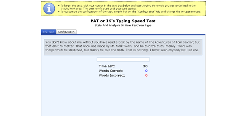
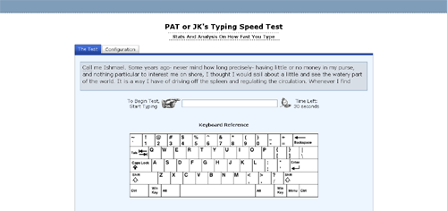
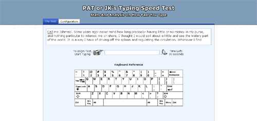
Recently I’ve taken to trying to improve the look of my Typing Speed Test. Below you can see the initial design, a design I put up last month, and the most recent design, which I put up this past weekend.


I made the initial design with the idea of keeping things as simple as possible, however, in retrospect, the page looks kind of unbalanced and the big yellow explanation box at the top kind of comes off as a little bit of an eye sore. The second layout was made with the aim of being a bit more stylish. I got ride of the yellow explanation box, threw in some small gifs, added a keyboard reference, and put in a header bar to make it seem a little less plain.
The third, and current layout, was made with the aim of trying to make something that, in my mind, looked good. I don’t think I quiet accomplished that, but I think I came up with something better than what I had. The interface seems cleaner and more balanced, and I like the additional color at the top of the page. The only thing I’m not sure I like are the header images, they seem a little cheesy. So I’ll probably keep tweaking the layout. My goal is to come up with something I can re-use on future (and existing) applications.