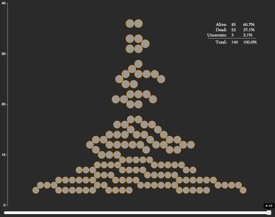
For any Game of Thrones fans out there, I’ve created a neat little interactive visualization. It ranks characters by how many episodes they’ve been in, makes note of who’s alive and who’s dead, and allows you to go backwards in the show’s history to see how things have developed over time.
It also reveals some interesting stats:
- After 40 episodes, the show has around ~140 notable characters.
- The show seems to kill an average of 13 notable characters per season, or 1.325 per episode.
- 37.1% of the notable characters have been killed off so far.
You can see a spoiler-free version of the visualization below (character avatars and death information has been removed):
The chart is written on top of d3.js, which is a web-based visualization library. I learned how to use it earlier this year and have been on the lookout for projects I could use it for. After seeing the bubble chart from Matthew Daniels’s Largest Vocabulary in Hip Hop visualization and noticing it was based on an example by Amelia Bellamy-Royds, I decided to see if I could create my own bubble chart.
D3 Context Menus
I didn’t see any d3.js context menu plugins while doing this project, so I wrote my own. I could have used a jQuery plugin, but I wanted to keep as much of the code within the D3 way as possible (it just made working within their event structure easier).
Other Game of Thrones Visualizations
So there’s are plenty of other Game of Thrones visualizations out there. If you’re looking for more, I’ve compiled a short list below of some of the best ones I’ve found.
- Events in the Game of Thrones – A visualization of the events from the first 5 Game of Thrones books.
- Game of Thrones Map – Interactive map of the Game of Thrones universe.
- Beautiful Death – A piece of artwork drawn for each episode in the show. I’m not sure if this technically counts as a visualization, but they’re pretty cool.

I love you.