In honor of labor day weekend, I thought it might be fun to create a visualization of data from the US Bureau of Labor’s website. For those unfamiliar with the BLS, here’s a quick run down from wikipedia:
The Bureau of Labor Statistics (BLS) is a unit of the United States Department of Labor. It is the principal fact-finding agency for the U.S. government in the broad field of labor economics and statistics and serves as a principal agency of the U.S. Federal Statistical System. The BLS is a governmental statistical agency that collects, processes, analyzes, and disseminates essential statistical data to the American public, the U.S. Congress, other Federal agencies, State and local governments, business, and labor representatives.
Included in this data collection is worker compensation, which is normally a pretty secretive topic. Many companies have rules prohibiting you from discussing your salary with colleagues, and it’s almost always a terrible idea to tell someone your salary. But not knowing what other people are making makes it hard to judge if you’re being paid fairly or not. This is why these stats are so interesting.
On their page for Computer Programmers, they provide the data they’ve collected as well as a number of tables and map visualizations, relating to employment rates and salary. Even though these tables and maps cover a lot of ground, the raw data set has a lot of information that isn’t shown on the page, like the 10th, 25th, 75th, and 90th percentile rankings for all of the different geographic areas measured. I thought it might be cool to try and come up with an interactive visualization that allowed you to easily see and explore this information.
You can see what I came up with here, or just check out the screen cap below (there’s over 480 areas in the actual chart, so below is just the top 14 best paying areas – for “Computer Programmers”).
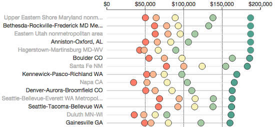
As you can see above, I decided on a chart where each geographic area was on its own line and its percentile data was color coded and plotted on a linear scale. I felt this made it easy to scan through the data and prevented any information from being hidden. I also put in some filtering options so you could narrow the data down to compare specific areas and specific job titles (e.g., Software Developer or Computer Programmer).
Computer Programmer vs Software Developer?
For some strange reason, the BLS has decided to distinguish between “Computer Programmer” and “Software Developer”. This goes against what many people think of when they hear the titles, and I honestly think it messes up their data set.
Initially I was confused when Maryland ended up in the top two spots for “Computer Programmer”, and it wasn’t until I read the fine print that I realized what was going on. The BLS defines a Computer Programmer as follows:
Create, modify, and test the code, forms, and script that allow computer applications to run. Work from specifications drawn up by software developers or other individuals. May assist software developers by analyzing user needs and designing software solutions. May develop and write computer programs to store, locate, and retrieve specific documents, data, and information.
They then define a “Software Developer, Applications” as:
Develop, create, and modify general computer applications software or specialized utility programs. Analyze user needs and develop software solutions. Design software or customize software for client use with the aim of optimizing operational efficiency. May analyze and design databases within an application area, working individually or coordinating database development as part of a team. May supervise computer programmers.
Aye yai yai, whoever created these definitions doesn’t know the field. I imagine a lot of people marked themselves down as “Computer Programmer” without realizing what the BLS thinks it means. It’s even clear from the stats that they’ve captured. For example, “Santa Fe NM” has really high paying jobs for “Computer Programmers”, but so-so paying jobs for “Software Developers, Applications”. If Computer Programmers really answered to Software Developers, this wouldn’t make any sense.
Which title a person chose was probably due to its regional use, and since the BLS has decided on their own definitions, the stats can’t be completely trusted. However, I still think they’re interesting, and I’ve gone ahead and added several Computer Science-related fields to the visualization’s Options section. At the very least, I think the stats give a good idea of the range in pay for different areas.
Anyway, I put this together mostly because I thought it would be a fun little project. I’m not a payroll expert, and I’d honestly take this information with a grain of salt, so please don’t make any major life decisions after playing around with the visualization.
One thought on “Visualizing bls.gov data for CS related jobs”