Like a book being judged by its cover, people tend to judge an app by its UI. Since jumping into a web development job 3 years ago, I’ve done a fair amount of client side work. I’ve helped redesign legacy applications with cool new UIs to lots of praise, even though the new apps had less features. And I’ve seen customers balk at feature-rich products that had so-so interfaces. And it makes sense, people like to use stuff that looks good, and if you can’t be bothered to put work into the design, what does that mean for the rest of the app?
I’m not a designer, and most of the stuff on this site was created before I really knew much about design. So as a result, a lot of what’s here looks pretty meh. After writing my last post, I took a look at the text fader that’s on this site and was kind of embarrised. I decided something needed to be done, so I started going through the various sections of this site and giving the layouts a much needed fresh coat of paint.
The new designs aren’t amazing by any means, but I think they’re a step up, and hopefully they’ll provide a better user experience. I decided to use Twitter Bootstrap for a lot of the basic look and feel, since it looks great and plays well with jQuery. I’ve also been trying to make the new layouts responsive, so that they also look good on mobile devices.
I’m not allowed to bring a cell phone into work, so until last year, I avoided getting a smart phone. However, now that I have an Android, I use it all the time outside of work, and I’ve realized that I’ve made a big mistake by avoiding mobile development.
So now that the background is out of the way, what has actually been updated so far?
- Text Color Fader
The first app I remember writing for this site (~1999). I actually overhauled the underlying code base while I updated the layout. In re-writing the code, I ripped out all of the YUI stuff and opted to go with the very awesome jQuery Spectrum color picker. The app’s layout was also tweaked so that it would work decently on a phone.While figuring out how to work an ad into the mix, I came across a neat tutorial on how to make Adsense ads responsive. So if you view the app on a phone, you’ll get a more mobile friendly ad :P.
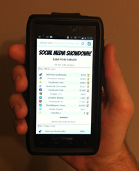
- Social Media Showdown!
Only made layout changes for this app, but made sure it would scale down to a phone nicely. - VB Array Tutorial
- VB 6.0 Example Archive
- VB 6.0 Code Bank
- 179 Ways to Annoy People
There are several more sections of this site I’m going to overhaul, but figured I’d do a write-up of what’s been done so far. I’ll also probably go back an revisit some of the sections I’ve already done if I get some better ideas. If you have any suggestions for anything just let me know.
