All posts by patorjk

New YouTube Channel

I’ve started a YouTube channel. So far I’ve only created a few videos, and I’m still trying to figure out what I want the channel to center around, though below you can see a couple of the videos I’ve created.

I figured the keyboard one might be of interest to some who visit this site, since it ties into the Keyboard Layout Analyzer app. The drone videos are fun, and there are a lot of neat places around me. Right now I’m trying to think of things the utilize photography and technology, though I’m still not sure what I want the channel to center around. Anyway, hope you like the videos.

Days become Weeks, Weeks become Months

It’s April. I’m now 34. I swear it was just yesterday I was eating lunch in the Commons at UMBC. Now I’m neck deep in adult stuff like figuring out my taxes and changing poopy diapers. People talk about how having 2 kids is more than twice as hard as 1 kid, but I think it’s just that the new kid takes up all the rest of the time that you did have, so you don’t really get time to rest.

patrickgillespie.com

I’ve finally decided to do something meaningful with patrickgillespie.com. I purchased it 8 years ago and have mostly neglected it. I previously had it setup as a “Portal for Patrick Gillespies”, but that was kind of a lame idea.

The other day I realized it would probably be a good place to show off my photography. Every photography youtube channel I watch says you need a portfolio to show off your best work. I have the domain, why not setup a portfolio? Therefore, I’ve recently re-launched the site as Patrick Gillespie Photography.

I wrote the site using AngularJS, Angular Material, and jmpress.js. I want to polish up the code a bit, but when I’m done I’ll put it up on github. This is my first time creating a portfolio, so I’m kind of just having fun with it. I’ll probably continue to add stuff to the site as time goes on.

AOLers Reconnecting

There’s a reasonably active Facebook group on the topic of old school AOL development that someone created a while back. If you were a member of that community it’s worth checking out.

Where is Bob?

You know you’ve reached a strange point in your life when you find yourself reminiscing about stuff you saw on Reddit almost a decade ago. However, sometimes something you read or see online just sticks with you. It resonates. Whether it makes you think, feel, or laugh, it leaves an impression. The “Where is Bob?” blog, which appeared on Reddit back in 2008, was such a thing for me.

Penned by a wickedly funny IT worker, the Where is Bob blog hosted a set of possibly non-fiction stories about a work place run by an obnoxious and often absentee manager named Bob. The submission garnered the praise of the Reddit community and earned just shy of 1,000 upvotes. That may seem like a pittance today, but at the time it was enough to get to the top of /r/funny and enough to get onto Reddit’s front page. It was also enough to capture the interest of a literary agent. I remember this last part because sometime after the subscribing to the blog, all of its posts disappeared and rumors swirled of a book that was to come out.

After what felt like an eternity (~17 months), “Where is Bob?” by Irina P. was self published online. Viral sensations have a very short half life, so it wasn’t surprising that the post announcing this publication netted only 10 upvotes. I was able to catch the announcement, and even though it had good reviews, I was too cheap to shell out the $10 or $15 the author was asking for it. I figured my stack of unread books was already high enough.

In the years since “Where is Bob?” was released, my pile has only grown larger, yet one day around 2 years ago I found myself in need of a laugh and thought about the old “Where is Bob?” stories. I decided to look the book up, and to my dismay, found that it and its corresponding blog were gone from the Internet.

I spent several evenings trying to track down the book: Maybe someone had uploaded a PDF, maybe it was still for sale, maybe someone had archived some of the public blog entries… but it was to no avail.

I’m never one to easily back down from a challenge though, so using some clues I found in various corners of the net, I deduced the author’s current contact information and sent her a message. I told her I that I had really enjoyed her stories and I offered, if possible, buy the book directly from her. In response she sent me this message:

Hi Pat,

Yes, indeed, it was I who wrote “Where is Bob.” How cool that you found me, despite my best efforts to stay hidden! “Where is Bob” was a really fun way to express my frustration with certain aspects of IT, which is the field that I used to work in. I even had a literary agent take interest in it, but she had a difficult time selling it to publishers because it was too short to be a novel and didn’t really fit into any other category. So I put it up as an ebook through Lulu Press, because there were a bunch of people who thought the idea was cool and were willing to pay to read the whole thing.

That was a long time ago. I have since switched careers. I currently work as a high school science teacher, and when I began that job, I decided to decrease my Internet presence as much as possible, because I wanted my non-school life to remain hidden and private from my students. I didn’t want them googling and finding that book. It also wasn’t really making any money (not after the initial surge of sales), so I didn’t think there was any interest in it. If I ever write anything again (which is improbable, albeit not impossible), I will publish it as pseudonymously as humanly possible, but if you want, I can add you to the small group of people who will be notified.

Anyway, thanks for the note, it was a pleasure.

All the best,
Irina

There was no mention of selling the book, and I didn’t want to push the issue too much. I understood her point too. I remember being in college and having friends giggle with glee about finding their professor on an online dating site. A saucy book of old IT stories from a previous career might not mix well with science class.

At the time I decided that was that and moved on. A few days ago I again thought of the book and once again I tried finding it, only to come up empty handed. This experience has underscored something that I’ve often thought about that seems to be against conventional wisdom: Stuff does disappear from the internet. As much as we think things will last forever once they hit the web, that’s only the case if the information has a caretaker that wants it around. If it doesn’t have such a caretaker, it’ll eventually either disappear or sink into the deep web.

Happy New Year!

Baltimore City Fireworks, New Years Day 2016

I know I’m a day late, but I was tired yesterday. I took this photo just after midnight from the HarborView building in Baltimore, Maryland.

I honestly hadn’t thought much about resolutions until yesterday. I watched a video that recommended making huge goals and then asked viewers the question: “How do you eat an elephant?” The answer was “one bite at a time”. It seems a little silly, but I like that way of thinking about things. Huge tasks are very achievable, you just have to break them down into small pieces and go after them one at a time.

I’m not going to publish my goals here, since science shows that telling people your goals makes you less likely to achieve them, but I’ve decided to set some big goals for myself. I hope whatever goals you’ve set for yourself come to fruition and that you have a great new year!

The Long Vacation

It’s been a year since I’ve updated this blog. What the hell have I been doing in that time?

Well… my daughter was born, I sold my house, bought a new house, took lots of photos, reentered and won the contest I talked about in my previous post, became much better at photoshop, reviewed a book for Packt Pub, grew a beard, shaved it, and started learning how to use video editing software.

This site has remained on my mind though. In the background of my other activities I think about what I could be doing with it. I’ve been at a stalemate about where to go with it though. When working on it started to feel like work, I drifted away.

In my absence this site has somehow seen it’s best year yet. Traffic is up more than 50% from last year… though truth be told, a big part of that increase in traffic is due to the run away success of my old Snake app. Why that app took off late last year I have no idea. It sat around collecting dust for the longest time, and then slowly started amassing a following. It’s even made an appearance in a CS lab in Ireland. One of my friends suggested that I start making more games, but I don’t want to be chasing traffic.

For the longest time I’ve had this mentality that this site needs to have a focus around “programming”, but that’s not what this site is. It’s a creative outlet. Some of the blogs I wrote in 2012 and 2013 were pretty dry and written with the mentality of this being a “programming blog”. But it’s not. I’m a programmer, and I blog, but this blog is its best when its organic musings about stuff I find interesting and not stuff I think a potential audience might want to read.

So no more book reviews, product reviews, or overly technical posts. This blog will become just a blog. I may write about something new I’ve done, or I may write about my favorite ice cream flavor. And maybe I’ll start to write more, or maybe you’ll see this as the latest entry in 2017. The goal though, will be for this not to feel like work.

With this change in focus I’ve also decided to change the coupling of patorjk.com and patorjk.com/blog. patorjk.com now gets its own page which focuses on the various things on this domain. This will make this blog feel less like a center piece for this site and more like just another section.

So what does the future hold for patorjk.com? Will there be another long vacation before I do another update? I’m not totally sure. The site is always on my mind though.

Adventures in Photography

It’s been a little quiet around here, but I haven’t forgotten about this place.

Around the start of October I started getting into photography. I had received a Nikon 5300 DSLR camera for Christmas last year, but it spent most of the year collecting dust. However, when the Autumn leaves started falling, I realized it was the perfect time to finally learn how to use the thing.

The Contest

Near the end of October I came across a newspaper article that detailed an amateur photography contest that Kinder Farm Park was holding. The park is run by the county and is 288 acres of forested areas, playgrounds, fields, and farm buildings. Upon finishing the article two thoughts were left running through my mind: I hadn’t realized large scale county parks were a thing, and there were only 3 days left until the competition was over – I needed to find this place and take some pictures.

I ended up making it to the park the day before the competition ended and ran around taking photos like a crazy person. Since it was a Thursday evening, I only had about an hour before it got too dark. I liked two of my photos enough to submit them, and to my delight, two weeks after the contest ended I got an email saying I had scored 2nd place in the People category for this pic:

Before I toot my own horn too much, there were only 9 entries in this category, so it’s not that big of a victory. The other 3 categories had 3 times as many entries, and last year there were a lot more entries, so I’m not sure what happened this year. I guess I got kind of lucky. However, I was still pretty thrilled. I even got interviewed by a local paper, which was kind of cool.

November-December

I’ve spent the past two months basically learning the in’s and out’s of photography (at the time of the contest I was taking all of my photos in auto mode). I resurrected my Flickr page, and was surprised to see that it was still a pretty cool place. Before coming back to Flickr, I briefly tried out Google+, and it was certainly very nice, but Google+ still seems like a ghost town. My belief is that it tried to be too many things (that’s a whole other topic though).

Anyway, I’m certainly not going to change this place into a photography site, but I think changing gears and learning about something new will help me bring more to the table when I finally do come back with some new content. This site is not going to go dormant though. I’ve also spent part of this past year as a technical reviewer for a new Packt Publishing book, so I’ve got an entry coming out about that, and there are a few other small things I’ve been working on, so I’ve got stuff in the pipe line for this site.

Photo Map

And lastly, after the Kinder Farm Park contest ended they released a gallery of all of the submissions. Since each pic listed the location where it was shot, I thought it might be fun to place them into a Google Maps map. If you’re bored you can check them out below.

Site Note: Some of these placements are guesses or approximations.

Rethinking Nutrition Calculators

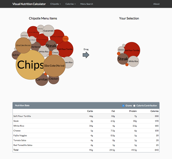
I’ve created a Visual Nutrition Calculator that allows you to visually inspect a restaurant’s menu based on the relative calorie, fat, protein, and carbohydrate values of the food.

wwww

The idea is to give a different view of a restaurant’s menu. Rather than picking your meal based on pictures, or choosing a meal and then seeing how many calories it has, the idea is to find and pick items based on their health characteristics. Additionally, a nutrition table is supplied at the bottom that lets you see the stats of your selected choices. You can even view the percent of calories that come from protein, fat and carbohydrates.

Genesis

The bubble chart idea came from a cool presentation by Jim Vallandingham on D3.js’s force layout. I had been looking for another side project to do with the D3 visualization library, and after playing around with Jim’s example bubble chart, I thought it might be fun to try and make my own. I just needed an idea of something to visualize.

Fast forward a few hours and its dinner time and I’m at chipotle.com. I’m toggling the different selections to see how they effect the output and suddenly it hits me! Nutrition calculators have been around on the web for almost two decades. And sadly, they haven’t really evolved much. You check a few boxes, maybe click on a picture of a hamburger, and then you push a button to see how many calories you’ll be eating. The tools don’t really help you make a healthy choice.

Using a bubble chart, I knew I could make a calculator where you could easily see the health impact of each item. It’d be sort of like WiseGeek’s What Does 200 Calories Look Like, except it’d be of what you’re currently thinking of eating.

I started the project shortly before I posted my entry on visualizing bls.gov data and I was originally going to include a whole host of helpful visual aids. My favorite being a sugar cube visualization that would show you the equivalent amount of sugar cubes you’d be eating (similar to Sugar Stack’s How Much Sugar is in Sodas pictures), but I nixed the ideas in favor of just finishing the main idea – I’m bad about starting projects and then not finishing them. Though I still like the sugar cube idea – I think it’d be a cool addition to nutrition calculators.

The Patent…

So I had just finished writing my nutritional calculator and was working on this blog entry when I discovered something that made my heart sink. It turns out there’s a reason that there hasn’t been a lot of movement in the nutrition calculator area, and that’s because back in 2003 the US government granted someone a patent for “Method and system for computerized visual behavior analysis, training, and planning” that covered most of the base aspects of a nutritional calculator. It’s two major claims being:

  1. A system of computerized meal planning, comprising:

    1. A User Interface;
    2. A Database of food objects organizable into meals; and
    3. At least one Picture Menus, which displays on the User Interface meals from the Database that a user can select from to meet customized eating goal.

  2. A system of computerized meal planning, comprising:

    1. A User Interface;
    2. A Database of food objects; and
    3. A Meal Builder, which displays on the User Interface meals from the Database, and wherein a user can change content of said meals and view the resulting meals’ impact on customized eating goals.

    I couldn’t believe my eyes. How could something so general be patented? What was the US patent office thinking?!

    I googled around and discovered the patent holder had been aggressively going after anyone they felt violated their patent. I went back and studied their patent information and sample images. Only their second claim didn’t involve pictures of the food, and that claim seemed to center around a Meal Builder and “meet[ing] customized eating goal[s]”. According to “summary of the invention” section of the patent, the Meal Builder was based around to picture menus. Looking at their sample images (Fig 9), I noticed they had alerts pop up when food parameters like fiber got too high. I reasoned with myself that nothing about mine used pictures or gave advice about goals in general, so I should be safe. But I still felt uneasy. It wasn’t until I came across some recent news stories that I felt comfortable again.

    Bravo Gets the Patent Invalidated

    To my relief, one of the companies sued back in 2012 – Bravo – decided to fight back, and in July of this year they got the US District Court for the Southern District of New York to invalidate the patent. Additionally, earlier this month a batch of Texas lawsuits that the patent holder had filed were dismissed due to collateral estoppel. The patent holder plans to appeal the NY ruling, but for now it looks like its safe again create nutrition calculators.

    Prior Art?

    So near the beginning of this article I mentioned that nutrition calculators had been on the web for almost two decades. Using the Internet Archive, I was able to find one by the Hearst Corporation that existed in 1996. It’s been defunct since early 2007, but finding it took around 10 minutes.

    If these types of apps existed in 1996, how was someone able to patent one in 2003? I’m actually not sure – and in a bizarre twist, the patent holder actually filed a lawsuit against the Hearst Corporation over a meal maker that they created for seventeen.com in 2011. The last I could find on the lawsuit was that it was being transferred to the Southern District of New York along with the Bravo case in late 2013. I’d be curious to know if the Hearst Corporation was aware that they had previously created a nutrition calculator back in 1996. Hell, I wonder if anyone involved in any of the cases actually took the time to see if a nutritional calculator existed in the Internet Archive.

    Another Patent…

    While researching the meal planning patent I also came across another patent that gave me pause. This one involved visual size and nutritional characteristics:

    A system is shown to teach individuals the relationship between the visual size and the nutritional characteristics of portions of food by using either a life size image of, or the corporeal finger of the individual as a scale against life size images of different sized portions of different kinds of food, while showing the nutritional characteristics of such portions; and to adjust the relative sizes of portions of food to provide a nutritionally well-balanced meal.

    This patent is now expired though, so thankfully there was no need to worry.

    Final Thoughts

    Even though small projects are unlikely to be the target of patent holders, it sometimes happens. I’m glad Bravo decided to challenge the meal planning patent. It costs them more money than settling*, but it makes things better for the little guy.

    I think visualization tools like D3.js could be really useful for nutritional sites. This app is really just sort of a proof of concept / prototype. I made it mostly just for fun to see how it would turn out. However, if I were running an actual nutrition site, I could see all sorts of crazy possibilities for something like this.

    * I originally came across the patent when I was using the Jimmy John’s nutrition calculator. The patent information is in small grey text under the “Add to Meal” button.

    McDonald’s 2014 Monopoly Game Odds Analysed

    McDonald’s is running their annual Monopoly Game until the end of the month. The highest prize is $1,000,000 – which goes to the lucky soul who’s able to find the coveted Boardwalk stamp amongst the 651,841,628 game pieces. That equates to every person in the US eating 2 Big Macs before the prize is guaranteed to be given out. Even the odds of winning the Powerball jackpot are higher (1 in 175,223,510), and its minimum jackpot is $40 million.

    Our brains aren’t really wired to intuitively grasp probabilities, and the marketing departments of big companies know this. With McDonald’s eclectic mix of a hand full of large prizes and a ton of small prizes, it’s clear they’ve put some serious research into what will get customers through their doors. And it works. Hell, the only time of year I eat at McDonald’s is when they run this contest – though I always sort of regret it later. It’s a fun contest, but I think knowing the odds gives you a more clear picture of what to expect.

    The Basics

    • There are 651,841,628 game pieces in play. Each game piece contains 2 stamps.
    • 156,210,425 prizes will be given out.
    • The prizes falls into 4 categories: food prizes, instant wins, online prizes, and monopoly prizes. See the below table for a statistical breakdown.
    Prize Category Number of Prizes Odds of Winning
    Food 128,769,022 19.75%
    Instant Win 25,780,151 3.95%
    Online 1,661,242 ??? (see below)
    Monopoly 1,359 0.0002084862245%

    Chance of Winning Illusion

    There might be some interesting psychology going on with how the game is played. Each game piece is 2 stamps, making you feel like you have 2 chances to win. However, the official rules only talk about the odds of game pieces, not stamps. This makes me wonder if only the game pieces matter, which would mean that at least one stamp on a game piece is always a loser. This would mean that half of the stamps you peel are just there for psychological effect of playing the game. You end up feeling like you have twice as many chances to win, when in reality, its just an illusion.

    Unfortunately it’s hard to confirm this hypothesis. If the odds of a game piece winning are 25%*, then each stamp should have an individual winning probability of 13.4%**. This means the odds of both stamps winning on a game piece are 1.8%***. This means you’d need a really large same set to confirm that both pieces can’t win. I have around 56 stamps from friends and family, none of which were double winners – but that doesn’t mean much, since the odds of getting a double winner with 28 game pieces is only 40% (1 – 0.982^28). To be over 99% certain that double winning pieces don’t exist, you’d need to peel at least 254 game pieces.

    This is just a theory though, and it could all be easily disproven if a double winning stamp shows up. This should happen 1.8% of the time, so if you’re really hungry you can test this out.

    * The rules claim you have a 1 in 4 (25%) chance of being a winner. However, this number is rounded. If you add up the number of prizes and compare it with the number of pieces, you see that the number is closer to 24%.

    ** I worked backwards for this number by finding the probability of both stamps not winning: (1 – 0.134) * (1 – 0.134) = ~75%

    *** Both stamps winning would have a probability of 0.134 * 0.134 = ~1.8

    Odds for Rare Pieces

    I’ve seen some sites structure their odds around finding a complete monopoly, but that’s just silly. There are only two types of pieces: rare ones, and ones that show up all of the time. If you find one of the rare pieces, you’ve basically won the prize.

    Stamp Odds Prize Number Available
    Mediterranean Avenue 1 in 651,842 $50 1000
    Vermont Avenue 1 in 144,583,163* Free Gas for a Year ($2,350 ARV) 4
    Tennessee Avenue 1 in 2,429,970 Mobile Wallet Prize ($3,150 ARV) 238
    Virginia Avenue 1 in 690,723,394 $5,000 5
    Short Line 1 in 57,833,265 $5,000 Target Shopping Experience 10
    Ventnor Avenue 1 in 8,691,222 Beach Resort Vacation ($6,500 ARV) 75
    Kentucky Avenue 1 in 32,592,082 Delta Vacation ($7,500 ARV) 20
    Water Works 1 in 162,960,407 $10,000 4
    Pennsylvania Avenue 1 in 1,686,343,601 Cessna Private Jet Trip ($16,900 ARV) 2
    Boardwalk 1 in 651,841,628** $1,000,000 1

    What do these odds mean? The best analogy I found was on a page for grasping large numbers. It gave the following example of how big 100,000,000 was: if you stacked 100,000,000 one dollar bills on-top of each other, they would reach 6.79 miles into the sky. That’s high enough to touch an airplane at cruising altitude.

    * These odds appear to be wrong, as they differ from Water Works which also only has 4 stamps available. However, this is what the rules page lists.

    ** The Boardwalk odds come from the rule page, however, the winning stamp is apparently guaranteed to be on a Big Mac. If you focus your energy on eating Big Macs, this means your odds of winning are 1 in 37,955,000.

    Online Game

    Not much has been written about the online game, there are two main reasons for this:

    • There are no set odds. This is because the chances of winning are based on how many people decide to play their pieces online.
    • The prizes are very “meh”. Most of the 1,661,242 prizes are Red Box Rentals (1,400,000) and My Coke Rewards Points (250,000). However, there are a few decent prizes, and there is a top prize of $50,000.

    Your odds of winning the $50,000 prize are the number of stamp codes you submit to the total number stamp codes submitted. Based on the 56 game stamps I’ve entered in, 3 were red box rentals. Extrapolating that out, the red box rental odds could be 1 in 20, which would mean McDonald’s expects 28,000,000 stamps to be entered in. This would mean your chance of winning the 50k per game piece would be 1 in 14,000,000. Now, 3 data points is too small a data set to make this assumption, so this should be thought of as just a back of the envelop calculation.

    However, assuming these odds were true, that would mean if you spent the next week buying Hash Browns and entering in the max number of stamps a day (10), you could bring your odds of winning the 50k up to 1 in 400,000. This seems like a neat idea until you consider that if you spent the same amount of cash ($35) on Maryland Monopoly Lotto tickets, you would have a 1 in 385,031 chance of winning twice as much.

    Food Items with Stamps

    For those interested, Hash Browns have the best price to stamp ratio.

    Name Price # Stamps Price Per Stamp
    Bacon Clubhouse $4.69 2 $2.35
    Big Mac $3.99 2 $2.00
    Egg McMuffin $2.79 2 $1.40
    Egg White Delight McMuffin $2.79 2 $1.40
    Fruit & Maple Oatmeal $1.99 2 $1.00
    Filet-O-Fish $3.49 2 $1.75
    Hash Browns $1.00 2 $0.50
    Large Fries $2.19 4 $1.10
    Medium Fountain Drinks $2.49 2 $1.25
    Medium or Large Hot McCafe Drink $2.59 – $3.39 2 $1.30 – $1.70
    Premium McWrap $3.99 2 $2.00
    Sausage McMuffin with Egg $2.79 2 $1.40
    10-piece McNuggets $4.29 2 $2.15
    20-piece McNuggets $4.99 4 $1.25

    For legal reasons, McDonalds also allows you to request free pieces through the mail. A couple of individuals tried this out by requesting 500 pieces and comparing the outcome to buying 500 hashbrowns. It’s neat as an experiment, but unless you’ve got a lot of free time, you’re best bet is just buying Hash Browns.

    Conclusion

    Unless you’re in the mood for McDonald’s, don’t make your lunch decision based on the Monopoly Game. If a game of chance is what you’re after, you’re better off playing the lottery. However, if you’re going to McDonald’s anyway, get an item with pieces, as the game does make their food experience a little more fun.

    Visualizing bls.gov data for CS related jobs

    In honor of labor day weekend, I thought it might be fun to create a visualization of data from the US Bureau of Labor’s website. For those unfamiliar with the BLS, here’s a quick run down from wikipedia:

    The Bureau of Labor Statistics (BLS) is a unit of the United States Department of Labor. It is the principal fact-finding agency for the U.S. government in the broad field of labor economics and statistics and serves as a principal agency of the U.S. Federal Statistical System. The BLS is a governmental statistical agency that collects, processes, analyzes, and disseminates essential statistical data to the American public, the U.S. Congress, other Federal agencies, State and local governments, business, and labor representatives.

    Included in this data collection is worker compensation, which is normally a pretty secretive topic. Many companies have rules prohibiting you from discussing your salary with colleagues, and it’s almost always a terrible idea to tell someone your salary. But not knowing what other people are making makes it hard to judge if you’re being paid fairly or not. This is why these stats are so interesting.

    On their page for Computer Programmers, they provide the data they’ve collected as well as a number of tables and map visualizations, relating to employment rates and salary. Even though these tables and maps cover a lot of ground, the raw data set has a lot of information that isn’t shown on the page, like the 10th, 25th, 75th, and 90th percentile rankings for all of the different geographic areas measured. I thought it might be cool to try and come up with an interactive visualization that allowed you to easily see and explore this information.

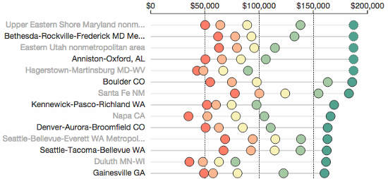
    You can see what I came up with here, or just check out the screen cap below (there’s over 480 areas in the actual chart, so below is just the top 14 best paying areas – for “Computer Programmers”).

    salary-data

    As you can see above, I decided on a chart where each geographic area was on its own line and its percentile data was color coded and plotted on a linear scale. I felt this made it easy to scan through the data and prevented any information from being hidden. I also put in some filtering options so you could narrow the data down to compare specific areas and specific job titles (e.g., Software Developer or Computer Programmer).

    Computer Programmer vs Software Developer?

    For some strange reason, the BLS has decided to distinguish between “Computer Programmer” and “Software Developer”. This goes against what many people think of when they hear the titles, and I honestly think it messes up their data set.

    Initially I was confused when Maryland ended up in the top two spots for “Computer Programmer”, and it wasn’t until I read the fine print that I realized what was going on. The BLS defines a Computer Programmer as follows:

    Create, modify, and test the code, forms, and script that allow computer applications to run. Work from specifications drawn up by software developers or other individuals. May assist software developers by analyzing user needs and designing software solutions. May develop and write computer programs to store, locate, and retrieve specific documents, data, and information.

    They then define a “Software Developer, Applications” as:

    Develop, create, and modify general computer applications software or specialized utility programs. Analyze user needs and develop software solutions. Design software or customize software for client use with the aim of optimizing operational efficiency. May analyze and design databases within an application area, working individually or coordinating database development as part of a team. May supervise computer programmers.

    Aye yai yai, whoever created these definitions doesn’t know the field. I imagine a lot of people marked themselves down as “Computer Programmer” without realizing what the BLS thinks it means. It’s even clear from the stats that they’ve captured. For example, “Santa Fe NM” has really high paying jobs for “Computer Programmers”, but so-so paying jobs for “Software Developers, Applications”. If Computer Programmers really answered to Software Developers, this wouldn’t make any sense.

    Which title a person chose was probably due to its regional use, and since the BLS has decided on their own definitions, the stats can’t be completely trusted. However, I still think they’re interesting, and I’ve gone ahead and added several Computer Science-related fields to the visualization’s Options section. At the very least, I think the stats give a good idea of the range in pay for different areas.

    Anyway, I put this together mostly because I thought it would be a fun little project. I’m not a payroll expert, and I’d honestly take this information with a grain of salt, so please don’t make any major life decisions after playing around with the visualization.

    Creating a d3.js Game of Thrones Visualization

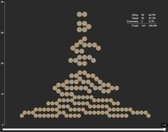
    For any Game of Thrones fans out there, I’ve created a neat little interactive visualization. It ranks characters by how many episodes they’ve been in, makes note of who’s alive and who’s dead, and allows you to go backwards in the show’s history to see how things have developed over time.

    It also reveals some interesting stats:

    • After 40 episodes, the show has around ~140 notable characters.
    • The show seems to kill an average of 13 notable characters per season, or 1.325 per episode.
    • 37.1% of the notable characters have been killed off so far.

    You can see a spoiler-free version of the visualization below (character avatars and death information has been removed):

    d3_got

    The chart is written on top of d3.js, which is a web-based visualization library. I learned how to use it earlier this year and have been on the lookout for projects I could use it for. After seeing the bubble chart from Matthew Daniels’s Largest Vocabulary in Hip Hop visualization and noticing it was based on an example by Amelia Bellamy-Royds, I decided to see if I could create my own bubble chart.

    D3 Context Menus

    I didn’t see any d3.js context menu plugins while doing this project, so I wrote my own. I could have used a jQuery plugin, but I wanted to keep as much of the code within the D3 way as possible (it just made working within their event structure easier).

    Other Game of Thrones Visualizations

    So there’s are plenty of other Game of Thrones visualizations out there. If you’re looking for more, I’ve compiled a short list below of some of the best ones I’ve found.

    • Events in the Game of Thrones – A visualization of the events from the first 5 Game of Thrones books.
    • Game of Thrones Map – Interactive map of the Game of Thrones universe.
    • Beautiful Death – A piece of artwork drawn for each episode in the show. I’m not sure if this technically counts as a visualization, but they’re pretty cool.