I Feel Kind of Nerdy

So I was thinking to myself today, “When would I ever use the Typing Analzyer?” The only situation I can think of would be if I got into some kind of argument over which keyboard layout was best, and even then I think I’d be kind of hesitant to play that card. Oh well, I think this project is one of those ones that is neat to make, but isn’t really that useful. Hopefully it can give passer-byers a couple minutes worth of amusement or possibly get someone to check out an alternative keyboard layout.

Besides questioning the relevance of what I’ve been doing, I’ve also made a few updates:

  • Added “Left Hand Dvorak” and “Right Hand Dvorak” layouts
  • Updated layout graphics
  • Added the Shift and Tab keys into the calculations
  • Fixed the IE issues (I’ve gotten in the bad habit of only checking my work in FireFox)
  • Added a personalized keyboard layout to the output

I stole the last idea from Tritonio, who created his own app for layout generation. I thought the idea was really really cool so I put it in (I’ll make sure and give you a link on the app’s page, once I straighten out the “Other Typing Resources” section). Right now the generated layouts are kind of silly, though they have some semblance of being correct.

I aim to finish up this app next week. I’m going to tweak a few things and then add in some stats and pie charts on finger usage. After that I’m going to move onto a new web app. After a brainstorming session earlier this month I’ve got a collection of neat ideas I want to explore. Part of me wants to do a web app a month until the end of the year, but I don’t want to set goals I’m not sure I can complete. I’ll do the next one and then decide where to go from there.

New Web App: Typing Analyzer

I’ve created a new web app that allows you to analyze and visualize the typing patterns you create when you use a Qwerty, Dvorak, or Colemak keyboard layout. You can find it here: Typing Analyzer.

If you have no idea what I’m talking about, the keyboard layout you’re currently isn’t the only one that’s out there, and not all keyboard layouts are created equal. Some are better for your wrists and allow you to type faster and with more comfort. Here are the layouts of the keyboards I mentioned above:


Qwerty


Dvorak


Colemak

My interest in keyboard layouts came after I read a Discover magazine article entitled “The Curse of QWERTY”. The article tells the story of the Qwerty and Dvorak keyboard layouts and makes a compelling case for switching from a Qwerty layout to a Dvorak layout. Here is a quick summary of its most important points:

  • The Qwerty layout was created in the early 1870’s before touch typing and without speed or comfort in mind.
  • The Dvorak layout was created in the 1930’s and is based on years of research. It takes speed and comfort into account.
  • On average, the left hand does 56% of the typing when a Qwerty layout is used. With a Dvorak layout, the right hand does 56% of the typing.
  • The Dvorak layout forces you to alternate hands more frequently when typing, this causes you to type faster.
  • Users type fastest on the home row. With a Qwerty layout, only 32% of your typing occurs on the home row. With a Dvorak layout, 70% of your typing occurs on the home row.
  • It’s hypothesized that the Dvorak layout will make it less likely that you’ll develop Carpal Tunnel Syndrome (CTS).
  • Anecdotally, people who develop carpal tunnel syndrome seem to find relief when they switch from a Qwerty layout to Dvorak layout.

There are more reasons, but those were the ones that stuck with me. I was so convinced by what I read that I switched my work and home keyboard layouts to a Dvorak layout by configuring some Windows XP settings in the control panel (to see how click here). This lasted for about 6 days (3 of those were over the Labor Day weekend), and then I had to switch back since learning the Dvorak layout was slowing me down at work. I also discovered that the Dvorak layout made all the nice Qwerty keyboard shortcuts (Undo, Cut, Copy and Paste) virtually unusable. This was a big minus since I use those shortcuts constantly. The Dvorak layout also over worked my right pinky. I found myself having to take typing breaks, something I hadn’t done since high school.

After talking to someone who had Carpal Tunnel Syndrome (something I’m worried about getting), I learned about yet another improved keyboard layout that preserved Qwerty’s bottom row short cuts and didn’t put massive amounts of stress on the right pinky. This layout was known as the Colemak. Unlike the Dvorak, the Colemak layout is relatively new (developed within the last 5 years), doesn’t have a lot of research behind it, and it doesn’t have a very large following (online estimates put the number of users between 650 and 1,300). It also wasn’t on my computer at work (I can’t install things on my work computer) so in order to use it, I’d have to talk to some sys admin people. However, the layout looks really promising.

All of this research is what motivated me to create the Typing Analyzer. I wanted to visually compare my typing patterns with the different layouts and get some stats on what hand and which fingers I was using the most (a feature I’ll put in soon).

Hopefully the user interface is straight forward enough. Its in the same vein as the Image Color Palette Generator and the Color Fader, but with some adjustments. I decided to start the page off with a section explaining which fingers you use for which keys, since I know a lot of people don’t know the exact fingerings. In fact, I know people who constantly use a computer yet still hunt and peck for keys. After the chart comes the application’s controls and after that comes a section for the output.

I have more features in mind for this program, but I figured I’d release what I had now just to see how it’d be received and to see if anyone had any suggestions. The other ideas I have in mind are:

  • Allowing a user to enter in a feed URL, so that the program can analyze all of their blog posts instead of having the user paste the text into the text box.
  • Give stats on finger and hand usage. Possibly also include pie charts.
  • Give recommendations to the user on which keyboard layout would benefit them the most.

Oh…

And I haven’t forgotten about patrickgillespie.com. I’m just not as excited about it as I was 10 days ago. I’m going to let myself mull over some more ideas before I take any action. I still don’t think I have the right idea for it yet.

Thinking Out Loud

Right now my plan is to make patrickgillespie.com a depot for random projects and ideas. I was thinking that it might make sense to move some of my more random content (the miscellaneous section and Javascript games) this new site. That’d allow me to narrow the focus here to tools and programming.

For this new site’s interface, the main idea I was throwing around in my head was for the user to see a bunch of images floating through space. Each image would represent a piece of content and none of the content would be related. The idea would be that this was just a bunch of random stuff floating through cyberspace.

I whipped up a quick prototype using Van Halen album covers, which you can see by clicking the above link, and was unimpressed with the outcome. The movement ended up being pretty jumpy, and I’m not sure I like how the images just disappear when they “hit the screen” (when they do that they’re reset to way back in the distance). I’m starting to think that this kind of stuff is best left to Flash. There’s also some other issues, but since this is just a prototype I didn’t bother with certain details.

Right now I’m thinking of stealing my slider puzzle’s interface for patrickgillespie.com since I liked how that came out and nobody ever uses that thing anyway.

I’m Not Dead

I’ve had a hectic past few weeks. Not the normal kind of “oh man I’m stressed”, but the “holy shit I’m stressed” kind of weeks. Things appear to be calming down now though. I’ve been thinking about new things I can do for this site, but all I’ve got so far are a bunch of half finished ideas and projects. Things coming in the near future (next month or so): A new version of the Image Color Palette Generator, the source code to that project, and a rough draft of patrickgillespie.com. The patrickgillespie.com project is the most fun, so that may be out first.

Web App URLs

I’ve decided to change the URLs to my web apps so that they are one level down. Basically, I think having someone type “patorjk.com/software/taag” is a little much. It’s easier to remember “patorjk.com/taag”. The “software” text doesn’t really add much value. I haven’t moved them all yet, and when I do I’ll 301 redirect the old links, but I figured I’d let people know my reasoning for doing this.

Exits

Months ago I removed my links page. I did this because I was replacing it with the links you see in the left panel under the headings “Interesting Blog Links” and “Programming/Hacking Links”. I’ve now decided that it was a mistake to do this. I’m going to keep the links in the left hand panel, but I’m also going to add the links page back in. It will now be called “Exits“. I haven’t had time to fully populate this page, but you can expect the Exits page to grow over the next few weeks. In the mean time, if you’re bored, here are some amusing sites to waste your time with:

Where is Bob? Tales of an Absentee Manager – A really funny blog about a manager named Bob who terrorizes his IT employees. I get the feeling this is fiction, but it’s still a fun read.

The Trolls Among Us – One of the most fascinating articles I’ve read in recent memory. A reporter dives down into the world of internet trolls.

Riddle Me This

Lately I’ve been exchanging riddles / mind puzzles with some coworkers of mine. I’m not really sure how it started, but one ended up on my white board at work and before I knew it everyone wanted to know the answer or had their own riddle to challenge me with. I’ve collected up some of my favorites. If you’re unfamiliar with one and you solve it, feel free to post your proposed solution as a comment.

As far as site updates go, I have some coming, but I’ve had a distracting past couple of weeks. Since January I’ve been suffering from tinnitus (ringing in the ears), but it didn’t really get bothersome until the middle of last month. I ended up going on a huge research quest for a cure, but it appears there are only things you can take to prevent tinnitus (NAC, antioxidants) and nothing that’ll really cure it. Right now it’s at a volume I can deal with, so I’m fine, but I want to caution everyone and let you know its important to take care of your hearing. Also, avoid things that are too good to be true. There seems to be a lot of snake oil out there when it comes to tinnitus.

Anyway, enough of my personal problems, on with the riddles…

1) In front of you there are ten boxes of books and a digital scale large enough and strong enough to hold all of the boxes when they’re filled with books. Inside of each box is ten books. In nine of the boxes, the books weigh 1.0 pounds each. In one of the boxes the books weigh 0.9 pounds each. Using the digital scale only once, how do you determine the box that contains the books that weigh 0.9 pounds? You may take the books out of the boxes and you can assume the weight of each box is 1 pound.

2) You’re one an island and you want to get off of it. There are two caves off the island. One leads to certain doom while the other leads off the island. In front of the caves there are two guards. One always tells the truth and the other always lies. You do not know which one is which. You may ask one question which they both will answer. What question can you ask that will guarantee you pick the right cave to get off of the island? [Editors Note: After much discussion, we discovered there were actually multiple answers to this question, so if you know the answer, try to come up with another one]

3) Four men are standing in a row. They are ordered tallest to shortest. The tallest man is facing west while the other three men are facing east. Each man is wearing a hat that is either black or white. Each man knows that there are 2 black hats and 2 white hats, however, they do not know the color of the hat that they are wearing. The tallest man cannot see anyone’s hat, the next tallest man can see the hat color of the two men in front of him, the next tallest man can see the hat color of the man in front of him, and the shortest man can see no one’s hat color. Imagine that the hat ordering from tallest to shortest is: black, white, black, white. Where the tallest person is wearing a black hat and the shortest person is wearing a white hat.

None of these men can move around, however, they can talk to each other – though they do not have to be truthful when answering each other’s questions. As soon as a man figures out his hat color he screams it out (and he cannot scream unless he really knows his hat color). Which man can figure out his hat color and why? [Editors Note: This one is easier if you draw it]

4) You have 25 runners. When raced, they always perform the same, and no two runners perform identically. You can only race 5 at a time, and once a race is over, the only information you get is the order that they finished in. How do you determine the fastest, second fastest, and third fastest runner using only seven races?

5) This was the puzzle that started it all. No one I’ve told it to has been able to figure it out. And it always takes a while for the answer to make sense.

patrickgillespie.com – What Should I Do With It?

Not many people search for the phrase “Patrick Gillespie”, but those who do find that the first listing is a short little article about Patrick Gillespie failing to register as a sex offender. Once you read it you can see that it’s not about me, however, it kind of sucks to know that that’s what people see when they Google my name. A few girls I’ve dated have even brought it up, usually just to make a joke, but it does solidify my concern that people find information about us by Googling us, and if someone is searching for me, I don’t want their first thought to be “Is this guy a sex offender?”

Today things took an interesting turn and I might be able to unseat that crappy website. I was notified by a fellow commenter at seomoz.org that patrickgillespie.com was available for purchase. This is the first time I’ve ever seen this domain available, in fact it just went back on the market around 30 days ago. I think for the past 10 years or so some realtor has had it, or maybe someone just had it parked, either way, it wasn’t very popular or memorable in its previous form. Part of me wonders if the owner let it expire by accident, but I guess that sucks for them. Though I did leave patrickgillespie.net and patrickgillespie.org available for other Patrick Gillespies to pick up.

My main concern now is, what do I do with patrickgillespie.com? I could have it point here, but I kind of want to do something a little more creative, I’m just not sure what. Here are some ideas I was tossing around in my head:

  • Personal Blog: This would be the easiest thing to do. However, I already have a livejournal I don’t update much, and I can’t say much about the work I do at work, so I’d feel like this angle might not be very fruitful.
  • Topical Video Blog: Something where I could post videos to get across certain topics. I do a lot of online research, and sometimes I find some interesting videos on sites like youtube. A blog that assembled video information on various topics could be interesting.
  • Resume Site: A boring option, and probably something that wouldn’t rank well, but a decent filler idea if I can’t decide on anything.
  • A Weird Art Project: Something like this, something that just makes people scratch their heads, however, they explore it further because it’s intriguing.
  • Patrick Gillespie Information Center: Some kind of web app that aggregates information on people named Patrick Gillespie.
  • Puzzle: Maybe have the page just be a puzzle of some sort. Like a riddle that the user has to solve and if they do they can get some kind of reward.

That list basically makes up the ideas I was able to come up with today. Does anything jump out as a good idea? If anyone has any suggestions, please let me know.

Did Yahoo Punish Me For Reporting Spam?

I’m a little prone to conspiousy theories, so I might be jumping the gun here, and I may end up looking totally silly, but I think Yahoo deleted my Color Fader from of their index after I reported some spam in their search results.

A little background: For some reason most of the pages on this site don’t rank well in Yahoo. For the month of May, only 1.87% of my visitors came from Yahoo. That’s compared to 46.37% that came from Google. The Color Fader was the only page that really pulled in visitors from Yahoo. It used to rank #1 for the search phrases “Color Fader” and “Online Color Fader”. Those phrases only brought in around 20 visitors a day, but that’s better than nothing.

Anyway, seeing as these are the only phrases that bring me anything from Yahoo, I check them out every once in a while to see where I am. Around 3 weeks ago I noticed a new site was #1 for them (not unusual – the results tend to get shaken up every so often). However, this new site had the exact same title as my site, so I was a little curious. I opened it up and discovered the page was just auto-generated gibberish with lots of ads.

I was annoyed, but figured I’d just report the site to Yahoo’s Customer Care. In my note I said something like “I was searching for my site when I discovered one that had the exact same title. This site turned out to be auto-generated spam with lots of ads.” I’m not sure why I mentioned I was searching for my own site, I guess I was just typing off the top of my head.

After I submitted my report, I got an email confirmation saying it’d be processed within 48 hours. I checked back twice within that time period. The first time both sites were there, although mine had recaptured the #1 spot. The second time I checked back, both sites were gone.

At first I thought they’d just done some reindexing and I’d fallen a bit. However, after some pretty thorough searching, I found that my app, along with that spam page, was gone from their index. I quickly filled out a resubmit form explaining what I thought had happened – that the reviewer had accidentally deleted my site. I read my message over a couple of times to make sure it was short and polite and then sent it off. A day or so later I got back this reply:

Hello Patrick,

Thank you for writing to Yahoo! Search.

If you are not seeing your pages in the Yahoo! Search results, they may
not have been indexed or they may not be in the top results for the
searches that you are conducting. Here are some Yahoo! Help resources
for submitting your page to Yahoo! Search:

http://help.yahoo.com/l/us/yahoo/search/indexing/indexing-06.html

and for improving your site’s ranking:

http://help.yahoo.com/l/us/yahoo/search/ranking/ranking-02.html

in the Yahoo! Search results. There are no current indications that your
pages have been blocked from the Yahoo! index. Please note that all
pages are at all times subject to Yahoo!’s Content Quality Guidelines
located at:

http://help.yahoo.com/l/us/yahoo/search/basics/basics-18.html

Thank you again for contacting Yahoo! Search.

Regards,

Carmen

So according to that email I wasn’t blocked, which was good. However, something still didn’t seem right to me. It seemed like too much of a coincidence that my app and the spam page would disappear from the index at the same time. So I decided to check out Yahoo’s Site Explorer to see what it had on my Color Fader. This is what I found (note: searching with the “www” brings up additional links):

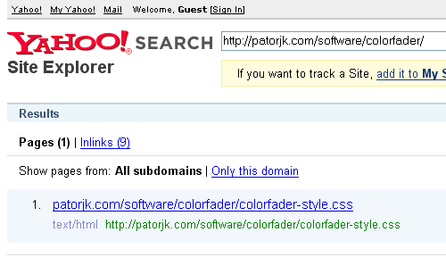
So for some odd reason only the style sheet for the Color Fader is in the index, and not the Color Fader page itself. Even though the links it has recorded for the Color Fader URL point to the app itself and not its style sheet. That seems really bizarre to me. My gut feeling tells me that the page was removed and didn’t drop from the index due to algorithmic reasons. I’m guessing it was either removed by accident, the person processing the spam report just glanced at the URLs and decided to remove them both, or the guy processing the request just didn’t like the fact that I was searching for my own site and decided to knock me off too. The last idea is a little cynical, but my mind tends to wonder all over the place when stuff like this happens. I suppose it could also be a quality issue, but I’d be surprised if that was the case since I don’t think I did anything particularly egregious in my design.

I probably shouldn’t care too much, the Color Fader is kind of girly app, but it annoys me when I try to do something good and then ended up getting punished. As thing are right now, I wouldn’t recommend reporting spam pages to Yahoo, since they might remove your content along with the spam.

It’s been over two weeks since I sent them my last email. I may try to resubmit the site again later today, however, if I say blocked, I stay blocked. It’s annoying, especially since I was beginning to like Yahoo, but I’m not going to lose any sleep over it.

Getting A Little Flashy And Free Icons

For some reason I couldn’t resist tinkering with the Text Ascii Art Generator (TAAG) app again. Last Wednesday I updated it so that its generated output would be displayed in Firefox without flickering. I used to do all my web development in IE since it was the most popular, but I switched to working in Firefox and Opera late last year since they have Error Console windows and don’t crash as much (if I have too many IE windows open, my computer slows down and I have to restart it). Though I still double check to make sure things work in IE.

Anyway, for this new update, I decided to get a little flashy and add in a footer that would fade-in when the user typed in a message. I’ve heard that presentation is an important part of the user experience and can be the difference between someone passing a site by and taking a closer look. Plus, after a rapid prototype, I thought the footer looked really cool.

Right now it currently holds the links for opening the message in a new window and generating an image from the text. They’re identified by these icons:

– – – – –

Which I found here. Luckily they’re licensed under the LGPL, which from what I gather from wikipedia, means they’re free for anyone to use as long as they don’t extend them (in which case they have to freely provide the extensions).

I think the new footer came out pretty well. TAAG now feels complete to me, though I’m not going to rule out any future updates. Later this week I’m going to try to get to work on some new stuff, but I don’t want to promise anything since lately I’ve been jumping around in what I work on.

$103

In completely unrelated news, if you’re bored, I found this website to be mildly amusing:

websitevaluecalculator.com

You give it a web address and it’ll tell you how much that site is worth. patorjk.com is apparently worth $103, though a couple of days ago it said 6k, so they must still be modifying their algorithm. I wouldn’t take an analysis from a site like this seriously, but it is kind of fun to see what it says different sites.

Souping Up WordPress and TAAG Updates

I can’t believe it’s been almost 2 weeks since I last updated. It seems like every day I think about something new I could do for this site, yet I only get to do a small portion of what I think about. I have more stuff coming down the tube, though I’m not sure when I’ll have it out. Sometimes I think I’ve got programmer ADD. Anyways…

New TAAG Feature

I added a new feature to the Text Ascii Art Generator (TAAG) program that allows you to easily generate an image of your ascii art output. In the outputted text, you’ll now see a new link, next to the “Open In A New Window” link, that says “Generate Image”. When you click it, it’ll generate a PNG file of your output.

Currently this feature is only available for FIGlet fonts. I had some issues with getting some of the more eclectic Arial font characters to print. I’ve even noticed that the AOL fonts (which are done in Arial) don’t show up correctly unless I’m using IE, which I find a bit annoying. Anyway, let me know if you have any problems with this feature or if you see any obvious flaws.

WordPress

After reading up a little bit on WordPress optimization tips, I decided to re-do this site’s sidebar. Mostly because I felt like the site related content should come before the outgoing links (sorry guys). I’ve also read that it’s good to have a large feed icon so I made one that blended in with this site’s color scheme. I almost went with this icon:

Which was generated using this nifty little program. However, I wasn’t sure how many people would actually understand what that thing was for, and it is kind of ridiculously big, so I went with something more traditional that had some explanation text (“Get Updates in a Reader”). I read somewhere about an experiment someone did that showed that people were more likely to click a link that said “get updates” than they were to click one that said “subscribe”. I think that makes a lot of sense too, since subscriptions usually cost money and involve you giving out some kind of personal information, which most people don’t want to do.

The other feed icons, the brand-name ones, I got here. I’m not sure how long I’ll keep them. They’re not ads, they’re just links to online feed readers. However, the big Google Ad below them is an ad.

Right now I’m not really sure if this is the layout I want for the sidebar. I may try some different configurations in the coming days, but I haven’t made up my mind. I want something that flows and looks nice and I think I’ve sort of got it, but not really. So you may see things change around a bit. If you have any suggestions/complaints/ideas, let know know.

I also added a feedburner counter. I’m not sure if that’s a good idea or a bad idea. However, I do appreciate the adds from those of you who have for some reason or another decided to subscribe to this site.

Subscribe to Comments

Lastly, I also added a new WordPress plugin that allows you to subscribe to certain comment threads on this blog. When you subscribe, you’ll get an email notification each time someone posts a new comment to that thread. I figured this would be pretty useful. At least I know it would have been if I’d had it when everyone was giving their updates in the Three Things to Say entry.

StumbleUpon-ed

I received 10,765 visitors yesterday, which is pretty good for a small site like this one. Late in the day yesterday I checked my stats and kind of had to do a double take. As soon as I saw the number I knew something had to be up. I checked my referrers and noticed StumbleUpon had sent me a boat load of people.

After a little investigation I found the Text Ascii Art Generator (TAAG) app had for some reason obtained a lot of “thumbs up”‘s from the StumbleUpon community. Someone added TAAG to StumbleUpon months ago, and I received a flurry of visits for a few days after that, but it topped off at around 600, nothing close to the traffic I got yesterday. I’m not sure what caused this avalanche of attention (it seems to have started in the mid afternoon), but it was pretty cool. I haven’t had that many visitors in a single day since I was mentioned in the Lockergnome News Letter back in 2000 (which at the time was a very popular online news letter – now it appears to be some kind of blogging community).

Right now it’s almost 1:30AM and as I write this, and I currently have 1.5k visitors for today already. It’ll be neat to see how long this StumbleUpon bubble lasts. So far my site appears to have held up without any problems too, so site5 earns itself a plus mark in my eyes. 10k isn’t a whole lot, but it’s good to see that sudden bursts of traffic are handled without a problem.

What I’ve Been Doing

It’s been a while since my last update. I’ve been jumping between projects, probably a little too much. Last weekend I was doing some C# stuff, and this past weekend I did a little Javascript (which I’ll talk about below). After reading all the hype on Python, part of me contemplated rewriting the Image Color Palette Generator (ICPG) in Python just as a learning exercise, but I decided to drop the idea after a little more thought. I’ve got too much going on already, and it’s probably better for me to focus on a hand full of projects than it is to try and get a taste of everything.

Ajax Image Uploading

I got image uploading to work separately from the image processing in the ICPG program. Using this nifty jQuery plug-in I was able to set the program up so the user could upload an image and then hit the processing button. It actually worked right out of the box, which is something of a rare occurrence.

ICPG used to handle image uploads, but I kept getting time out errors because my host only allows 15 seconds of processing time for each php file before it kills it. By having image uploading occur separately, I think I can get around this.

However, even though I have something that works now, I’ve decided to wait on uploading it (sorry for being a tease). The new version seems kind of hacked together and since uploads have security issues, I figured I’d take some time to double check everything and try to speed things up as much as possible. I also want to tidy up the interface and get rid of the page reloading.

Well, that’s all for today, I should probably be getting to sleep now since I have to get up for work tomorrow.