All posts by patorjk

Your Security Software May Be Unnecessarily Slowing Down Your Internet Experience

One easy way a webmaster can speed up their website is by enabling gzip compression on their web server. Most major websites do this and all modern browsers support receiving gzip encoded content. Sending out gzipped components greatly reduces the size of the response a web server sends to the browser and leads to the user having a faster experience with the website.

1 out of 5 US users don't take advantage of gzip compression on the web
Original Photo By allyaubry

Despite this being a plus for everyone, according to the book Even Faster Web Sites,around 20% of US users do not experience this enhancement. The number goes down to 15% when a world wide audience is considered, but that’s still a decent number of web surfers. The book states that the culprits behind the slowing down of the net for 15% of its users fall into two main categories:

  • Web Proxies
  • Computer Security Software

The reasons for this are that the above want to observe the responses from the web server and don’t want to have to decompress the files, so they either remove or mangle the “Accepts-Encoding:gzip” message that your browser sends to the web server. This leads to the web server thinking that the browser doesn’t support gzip compression, and therefore it sends back uncompressed data. The reason for mangling or stripping away the “Accepts-Encoding:gzip” message may have been to try and minimize the number of CPU cycles needed to examine data from the web server, but increasing download time to get around decompressing data is a poor trade off.

Many newer security software suites have since rectified this problem, but there are still some out there that unnecessarily hamper your web surfing. You can check and see if you’re apart of the 15% of people who don’t recieve gzipped data by going to the following link: Gzip Compression Test Page

Photo By alumroot

I’m writing this entry mainly because I’m doing a lot of front-end optimization at work and I ended up discovering that I was in the unfortunate 15% of web users who were missing out on a faster web experience. I also found out that my parents were in the same boat. If you click the link above and discover you are also not benefiting from gzip compression on the web, it’s worth temporarily disabling your security software and seeing if it is the cause of your problems. If you are unable to isolate the problem to software on your computer, it may be a web proxy which is removing/mangling the “Accepts-Encoding:gzip” message, and if that’s the case, you’re pretty much out of luck unless you control the proxy.

If you isolate the problem to your security suite, I would either try upgrading the software or switching to a different service. I dual boot my machine with Windows and Linux (my problem was only on Windows) and for Windows I’ve currently switched to using Microsoft’s Security Essentials for my virus checker (along with SpyBot), which LifeHacker seems to think is good enough, though I’m currently still researching the best tools to use.

If you are a webmaster and are interested in enabling gzip compression, you can find an easy-to-follow tutorial on how to do it here. If you want to go a little further down the rabbit hole, Yahoo! has put together a very nice list of techniques you can use to speed up your website.

Google Dictionary + Urban Dictionary + Flickr API

One of the characteristics of web browser extensions that excites me is that you can write plug-ins for your favorite websites. For my next extension I wanted to create something that was a plug-in to a specific website or websites. After mulling over possible ideas, I decided to create an extension would augment the definitions from dictionary websites with relevant images. The result is Image Definitions for Dictionaries, which is a Chrome web browser extension that augments the results of Google Dictionary, Google Search, and Urban Dictionary with images from Flickr.

Image From Homer Defined

The idea for this extension came from an episode of the Simpsons where Homer is repeatedly defined in the dictionary, with his picture appearing next to certain words. I thought it would be interesting if that’s how all dictionaries worked. They would have an image next to the word they were defining and that image would be determined by what the web thought was most relevant. I thought this would especially be interesting for the more eccentric dictionaries like Urban Dictionary. Urban Dictionary does already have an image feature, but it’s based on user uploads and isn’t heavily used.

After playing around for a little bit, I had an extension that worked for the previously mentioned sites. Below you can see a slideshow which lets you see how the Flickr thumbnails are integrated into the dictionary webpages (clicking on a thumbnail within a dictionary site will take you to the image’s Flickr page):

Previous Image
Next Image

info heading

info content

Using the Flickr API turned out to be a breeze, though most of the functionality I needed was already provided in an example created by Google. I did briefly look into using other APIs, or having the option for multiple APIs to be used, however, I wasn’t able to find a service comparable to Flickr’s API. Google’s has Google AJAX Search API, but that appears to be aimed at providing searching services and it doesn’t seem to give you access to individual thumbnails. I looked into some other services too, but nothing jumped out at me.

Anyway, I hope this extension can be of use to some of you or provide you with some entertainment value. If anyone has any requests for sites I should support, or has any suggestions for the extension, please let me know.

Typing Speed Monitor Version 1.0.2

Photo by ktpupp

I’ve made a small update to my Typing Speed Monitor Chrome web browser extension. You can now exclude statistics that come from certain domains. It was a feature requested in the comments section and I figured it would be useful for people who don’t want certain websites to effect their statistics.

I’m not sure how far I want to go with this app. I have a couple more feature ideas, and I would have added more with this update if I had not been busy working on another extension (see my next update). We’ll see though. If you have any feature requests just let me know.

Trying Out Chrome Extension Development

After being somewhat frustrated with a web app I was having to repeatedly check, I decided to try my hand at writing a Chrome web browser extension. I basically just wanted to have a little notification pop-up when the web page told me a certain event was occurring, that way I wouldn’t have to keep checking it. After tinkering with one of Chrome’s sample extensions, my page checker/notifier was up and running perfectly. I had expected its development to be kind of painful, but it luckily wasn’t painful at all.

Typing Speed Monitor

After its creation I decided to explore extensions a little more. I had a few ideas in mind and figured I’d implement one to see what I could do. I decided to first go with creating a “Typing Speed Monitor”, something that would capture what an average user’s typing speed was, tell them how much time they spent typing, give them statistics about what they typed, and give them a visualization to play around with. It was a pretty simple idea, but it involved messing around many of the areas of extension development and I think it came out well, so I think it was a good first project (not counting the project I created out of an example). If you’re interested, you can download it from the Chrome Extension Gallery here.

I’ve also uploaded the source to the extension to patorjk.com and you can check that out here. Since this is a pretty basic extension, nothing too complicated is going on, but I figured I’d post it up in case anyone was curious as to what was going on underneath the covers. I have a few more ideas for additional features, but I’ll first see if anyone actually uses the thing. Also, I’d be interested in making this app more internationalized, but I’m not completely certain on how the JavaScript keycodes work for foreign keyboards. If anyone has any information on this please let me know.

On a related note, later this year Google will unveil the Chrome Web Store, which actually sounds kind of promising. It’ll feature web applications, Chrome themes, and Chrome Extensions (the extensions will be moved from the gallery to the store). The store will feature free applications along with ones users can pay for. I really like the idea of a repository for web apps, and it seems like it’ll give developers a good outlet for their ideas. Anyway, it’s something to keep an eye on.

I Handed in My Letter of Resignation

Last week I handed in my letter of resignation to Northrop Grumman, the company I’ve worked at for the past 4 years. I was both excited and nervous at the same time. Nervous because it was a big step, and excited because I was starting a new job as a subcontractor at a small company in two weeks.

Photo by gabork

The past three years I’ve spent most of my time creating and maintaining Java and Tcl/Tk applications, with the majority of my time going to Tcl/Tk development. Both of these are fun languages, but I kind of wanted to get away from these as my primary focus and move into doing web development. Northrop is a pretty huge company and allows people to move around, but from the inside it looked like my future involved mostly C/Java/Tcl, so I decided it was time to see what was available outside of the company.

I’ve had a few friends successfully change jobs within the past year and decided to hit up one of them about possible jobs in his company. I ended up interviewing for and landing a job as a PHP developer. Since I’ll be a subcontractor, what I work in will vary from project to project (just like at Northrop, actually), but I’m in a position to take on a more diverse set of projects that I think will be geared more towards my interests. I also think getting to see how smaller companies work will be an interesting experience.

Lastly, I’ve decided to carry on with my rule of not talking about work on this blog, with the exception of big announcements, so this will probably be my last work themed entry for a while. Hopefully it helps me pick up some cool new skills and I’m am able to apply some of what I’ve picked up making the content for this site professionally. Also, I know I’ve sort of been neglecting this site due to perparing for the new job, but I think this site will benefit from it in the long run. If you’re interested in changing jobs and have any questions feel free to shoot me an email me or post in the comment section below.

Muller Images Experiment

The Muller Formula is a neat little color formula that aims to predict which sets of colors people will find pleasing. No actual formula is given for it, but it’s concept is described. Given a set of colors with the same hue but a different lightness, the colors with the lighter hues should be shifted to a more naturally bright color and the colors with a darker hues should be shifted to a more naturally dark color. I thought this was a neat idea and figured I could possibly simplify it to work with a single color (what I decided to call a “Muller Color”). If a color had a high lightness, its hue would be shifted to a naturally light color. If it had a low lightness, its hue would be shifted towards a naturally darker color.

HSL Color Wheel
Image By Jacob Rus

The original article used a the traditional artist’s Red-Yellow-Blue color wheel. I wasn’t able to find a good conversion formula to go from the Red-Green-Blue color model (RGB) (which is popular in computing) to the Red-Yellow-Blue color model (RYB), but I did find formulas to go from RGB to the Hue-Saturation-Lightness color model (HSL). I figured this would work well since the HSL model had everything I needed to calculate a “Muller Color”. I could detect the lightness of a color and then adjust its hue accordingly.

Looking at the HSL color wheel, I decided to use the primary colors (Red, Blue and Green) as the more naturally dark colors, and the secondary colors (Yellow, Cyan, Magenta) as the more naturally light colors. This decision was just based on my own judgement. Using the HSL color model and the concept described by the Muller Formula, I was able to generate interesting colors from RGB inputs. And to make a long story short, I ended up using this idea in my Image to Color Palette Generator app. A color palette would be generated of an image, but in addition, the user would also see a palette of the corresponding Muller Colors.

Primary and Secondary Colors
Image By SharkD

I figured I was done with this idea until I received a recent email from someone suggesting I take the images people input into the Color Palette Generator program and create “Muller Images”. Basically, call the Muller Color formula on every pixel in the image and generate a new image. I thought this was a really cool idea so I whipped up a quick prototype which you can see here. The shift percent indicates how much a color should shift. For example, if the color is between red and yellow and the shift is 100%, it will become yellow if it’s light and red if it’s dark (a dark yellow would even end up becoming red and a light red would end up becoming yellow). If the shift is just 50%, it will just shift 50% of the way closer.

Unfortunately, the results weren’t as stellar as I hoped. Calling the Muller Color formula on every pixel caused them to gravitate towards similar colors, so the resulting image tended to look like poorly compressed gifs. An example of a 10% shift can be seen in the Bernie Madoff pumpkin pic below.

Normal Image and Muller Color-ed Image

It was still a cool idea, and maybe it could still be used for something, though it’d probably have to be tweaked a little bit. There are other images available to Muller-ize on the experiment page if anyone else is interested. Thanks to David Dailey for the idea on this one.

Married!

My wife and I cutting our wedding cake

On Saturday I got married :). The past couple of months have been a little hectic, though probably not as much for me as for my wife. I’ve had a lot of stuff going on and I do feel a little bad that this site has been put on hold a little bit. However, weddings are crazy and I had no idea how much energy goes into them (including this wedding, I’ve only ever been to 5 weddings – 4 of them have been in the past year and a half). Our wedding was held at the Engineer’s Club in Baltimore and there were 130-something attendees.

Since the wedding is now over, activity on this site will probably pick up some. I’ve been reading a lot of books in my spare time so I may do a few book reviews, however, I don’t want to turn this page into a book review site, so if I do go that route I’ll space them out somewhat.

Super Mario Bros Groom's Cake

Also, before I forget, my advice to anyone getting married soon would be this:

  • Wear comfortable shoes. My feet were killing me at the end of the night.
  • Dance lessons were well worth it. Take them!
  • Try to talk to everyone during dinner and don’t get stuck at one table.
  • If there’s some food you want, have someone get you some or have it set aside (I missed out on the delicious strawberry layer of our cake – and on the delicious pigs in a blanket finger food).
  • The day will be a lot of fun, don’t sweat it!

Lastly, the cake to the right was a groom’s cake that my bride had made for me :). She gave them some pics of other Mario wedding cakes so it’s similar to them, but toned down since it was just for a rehearsal diner. Mario and Peach were a little pudgy, but I thought it was a really, really cool cake. At the time of its making I was kind of obsessed with the New Super Mario Bros game for the Wii, which is why she had it done.

“Pro JavaScript Design Patterns” Book Review

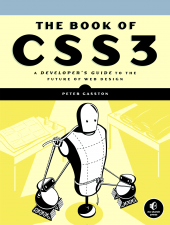
Pro JavaScript Design Patterns

For a while I’ve been meaning to read a book on design patterns, which are ways to design and structure solutions to common problems in order to create efficient and optimal results. I missed a chance to take a course on them back in college when I took Cryptology instead, and have since been meaning to sit down and read up on what’s been developed and what can be useful to me. So it was to my happy surprise when I stumbled across Pro JavaScript Design Patterns in the book store a while back.

The book is broken into two parts. The first part explains how object oriented programming concepts work in JavaScript and how to implement the ones that aren’t built into the language, such as interfaces and private members. The second part of the book focuses on a common set of design patterns and how they can be implemented in JavaScript. It covers the following patterns, giving a chapter on each one: Singleton, Factory, Bridge, Composite, Facade, Adapter, Decorator, Flyweight, Proxy, Observer, Command and Chain of Responsibility.

Before I go any further, while I’m going to write a mostly positive review for this book, I should say that I initially tried to read it around 18 months ago, but stopped after I finished the first section. I re-read it from start to finish about 2 months ago. I stopped the first time I tried to read it because the book introduces a lot of ideas and I was a little confused on some of the concepts it touched on. Specifically, I was confused with how constructor functions worked and how a function’s prototype property worked. I got distracted trying to understand this and picked up another book and ended up not coming back to this book (it’s hard for me to get back into a book once I’ve set it down for a while). As for constructor functions and the prototype property, a good explanation of them can be found here.

I had better luck on my second read through and found the second half of the book to be an easy read. Though each chapter focuses on a different design pattern, some of them use patterns introduced in earlier chapters, so it’s actually a good idea to read the chapters in order. Each of these chapters starts by explaining the basic idea behind the pattern and then goes into a couple of real world examples of how the pattern is used. The chapters close by discussing the benefits and drawbacks of the pattern they introduced and some advice is given to help you identify situations where using the pattern would be a good idea.

Overall, I found this be to be extremely interesting. I could possibly have learned about the different design patterns by reading online tutorials, but being able to look at solutions in JavaScript was very helpful. Also, after reading certain chapters, I felt like going back and rewriting some of my old apps (though I’ll contain myself). Knowing about this collection of design patterns is a huge plus for me and for that alone I’m glad I read this book. I wouldn’t recommend this book to someone who doesn’t have a good understanding of prototypal inheritance, but if you feel like you do, this book is worth checking out. If you don’t, I would recommend looking up some design pattern tutorials online and trying to learn about the common patterns, you’ll be glad you did.

On a side note, I was also amazed at how many of these patterns I’d seen before. It certainly gave me a better appreciation for some of the code bases I’ve seen in the past. I also found that I used some of the patterns already unknowingly, but that I didn’t have a name for the technique I was using.

If I could go back in time I would still probably take that Cryptology class, but I would also try and read up on Design Patterns too. If you have a few extra minutes, it’s worth reading up on them.

Quiz App Release

I have a beta version of my quiz app ready, you can check it out at one of the following links:

  • Quiz Guide – Same page shown a few entries ago, except this time the link to the Tcl/Tk quiz works.
  • Tcl/Tk Quiz – My first programming quiz for the PK app. I still plan on adding more questions, though I felt it was important to get a beta version out.

Right now all I have ready is a Tcl/Tk quiz. I’m guessing 90% of the people who read this will have no idea what Tcl/Tk is, but it’s a fun little scripting language that pops up in a lot of different places. Even if you aren’t familiar with it, the quiz will give you a feel for what the others will look like. I’ve set things up so that the quizzes themselves are JSON files, and are read in and generated on the fly by a single PHP page. The URL is set up to look like a directory, but it gets rewritten and pointed towards the PHP page (which will currently display the Tcl quiz no matter what, even if the quiz directory isn’t tcl-tk-basics).

Results Page

The quiz engine is currently set up to track multiple variables, with one variable acting as the “correctness” value to determine if a question is right or wrong. However, using a correctness variable can be turned off. The ability to track more than one variable allows the quiz to track different types of answers and to measure more than one thing. At the end of the quiz you’re presented with a table showing how you did in the various areas the quiz measured. Tracking multiple variables is how I imagine those online-dating site quizzes to work (the ones that will tell you about your personality, etc). I figured I’d keep my app as flexible as possible in case I wanted to do more creative things with it (though I have no plans to get into the online dating site world, I just want a flexible app).

Right now there’s only one type of question (multiple choice), though I hope to add more in the future. You also don’t lose points for incorrect answers. I’m still not sure if I want to add that ability in.

Also, while searching for icons to use in this program I found some pretty good resources, so I figured I’d share them here:

If you have any suggestions for the quiz app please let me know. I don’t think I’ve wasted as much time on any other app fretting about things that people probably wont care about. The app was actually partially re-written a couple times this past month. There’s was an ExtJS version, a version that used HTML tag generation instead of createElement (I’m still not sure what’s best), and lots of stuff I kept taking out and putting back in. However, I figured it was best to post a version up before I got old and gray.