Category Archives: Development Thoughts

Fake Like Buttons

This past weekend I updated my photography website to use MUI v5. The upgrade was mostly painless and while I was poking around I did a few other minor updates – the most fun being the ability to toggle Baltimore’s power grid on and off. I think I want to do more interactive stuff like this in the future. It’s only been up for a few days, but that light toggle is by far the most clicked thing on that site.

While I was mucking around in the code I also removed the faux like button that had previously accompanied each photo. The like button hadn’t been connected to anything other than my analytics, but it would shoot out confetti when clicked and fill-in to indicate that a like had been left. Why did I have fake like buttons on the site? Good question…

Back at the start of the year I had the following shower thoughts (those “profound” thoughts that only come to you while you’re in the shower):

  • Have like buttons become the dominant language of the internet? Do people click them to indicate they like something? Or is the clicking of a like button dependent on factors like the platform it’s attached to?
  • How often do people unlike things? And what would happen if a website became defensive and started arguing with you about taking away a like?

I found the second thought especially amusing and after laughing about it to myself I decided I would put something into my new photography website to test these ideas out. And just to be up-front – and before I get too far into this story – I’ll say that the results of this “experiment” weren’t very profound (as are most shower thoughts), but maybe it offers a few nuggets of wisdom somewhere.

Anyway, I launched the new photography site this past February and over a 7 month period 3,333 unique people visited it. On average they spent 1 minute and 13 seconds looking around and in total left 236 likes. This indicates to me that people don’t click like buttons to communicate they like something (my photos aren’t that bad, right? right??). The decision to click seems to be more nuanced. It could also be that people were suspicious of a like button that didn’t have an obvious association.

In retrospect this seems pretty obvious. When I click the thumbs up button on a YouTube video, I do it knowing I’m helping the creator and/or helping the algorithm so it can provide me with personalized recommendations. If I saw a random like button on a website I don’t think I would click it unless I knew what the side effects were.

The second part of the experiment produced another non-shocking conclusion: unliking is pretty rare. I had set things up so that if someone attempted to unlike a photo, the site would popup with a notification letting them know they must have made a mistake and not to worry, the photo was still liked. If the user continued to press the like button, the site would become increasingly frustrated in its notifications to the user until finally calling them a filthy bastard and letting them unlike the photo. 

I laughed at the thought of this happening and after I launched the new site I checked my stats every few days to see if such an event had occurred. I figured that after it happened a few times word would get around and I would see a whole bunch of unlike events in my analytics. However, no such thing happened. After a month I realized that unliking something is a very rare and if I ever wanted a chance of someone seeing my gag I would need to make some alterations. To help with unlikes I decided to add a confetti explosion animation to the like button. I figured some visitors would want to see it more than once, leading them to unlike and re-like a photo.

Over the course of 7 months, 27 unlike events occurred, and only 11 of those made it to the final message (which took 6 clicks). Nearly all of these were me, so this gag was maybe too confusing and too hard to find ?.  As for the remaining 16 unlikes, I assume that most of those were people who just wanted to see the confetti animation again. These people were probably super confused by the message that popped up, and they probably thought I was some super sensitive prude or something. In hindsight, it does seem like an odd gag to put in a fine art photography website.

If there’s anything I learned from this it’s probably that unlikes are rare and that people like with intension – they aren’t going to click something if they don’t know what it’s for. What started as something that had me laughing in the shower ended with me realizing I had made something that was amusing only to me. I suppose it’s probably best to leave shower thoughts at the shower.

Becoming the Maintainer of an Abandoned Open Source Project

Lots of ink will probably be spilled documenting the stories of what people did during the summer of 2020. With COVID-19 spreading throughout the world and many places going into lock-down, it was an uncertain and strange time. Many people took the opportunity to catch up on old TV shows, learn about investing, or create a side hustle. Me? Well, somehow I found myself becoming the maintainer of one of my favorite open source projects.

Part 1: The Big Rewrite

Almost 4 years ago I was gearing up to rewrite a rather huge AngularJS app. I had been a bit disillusioned with Google’s decision to kill off AngularJS (don’t get me started with Angular 2), and I was looking to build an app that wouldn’t be tied to the whims of Google, since they have a tendency to shut things down. After surveying the landscape, a solution involving the open source libraries React, Redux, and Material UI seemed like a good fit. All that was left was finding a good datatable component…

mui-datatables looked clean and worked smoothly. It made my app look beautiful, and I was excited. To add to this, the official github repo seemed to be buzzing with activity. My first feature request got 12 reactions and a bunch of comments. There was clear enthusiasm about this project, and it stood out amongst all of the Material UI based datatables I evaluated. I felt like I’d found the final piece to my puzzle.

For a while everything went smoothly. I was no rush and my work had me juggling several projects, so the rewrite took place in-between other tasks I was doing. It wasn’t until I was a few months in that I realized I needed an ability that mui-datatables didn’t provide. “No worries” I thought, “I’ll just put in another feature request”, but when I checked the repo, I noticed Greg, the library’s creator, was no where to be seen. Instead, someone named Gabriel was now running the show.

At first this was fine, and I was glad to see someone had taken up the mantle and was moving the library forward, but I soon found myself increasingly frustrated. I was so close to having the library that I needed, yet many of my pull requests (PRs) were left to languish and some updates to the library made my life harder. To add to this, Gabriel wanted to rewrite the whole library, deeming its internals fundamentally flawed. He made a pinned issue announcing this big rewrite (“Version 3.0”), and said it would fix the table’s internals and possibility completely change its API. However, after this announcement he continued to work on features for version 2.x, and in updates months after this announcement he would state that he hadn’t started on version 3 and was still thinking about things.

I was concerned. Once again I looked at other datatables, but I was filled with dread when I concluded that mui-datatables was still the best fit for what I was doing. I either had to stick it out and convince Gabriel to take my PRs, or fork the library and be on my way… and well, I forked it. And that actually turned out to be a pretty freeing experience. But there are downsides to forking that cannot be ignored:

  • You don’t get updates from the community – you’re on your own.
  • When you eventually leave your position, you leave the next developer with learning the fork you made. I’ve been in this boat and it’s not a fun boat to be in, especially as the fork gets old and bugs are found.

After the app I had been working on launched, I thought a little more about these 2 points. One of the key reasons for the rewrite (but not the only reason) was to get off of the now archaic AngularJS framework so that future developers could easily jump into the project. But leaving someone with a forked library that was heavily modified seemed to clash with this idea.

I decided to once again check in with mui-datatables to see if there was some way we could reconcile. What I found was 60 PRs, 2 pages of unanswered issues, and someone @-ing Greg and Gabriel, asking if the project was dead. The last release was 3 months old, and it had a number of problems (a malfunctioning resizable column feature, the responsive design was broken, etc etc). After Greg and Gabriel, I was the 3rd biggest contributor to the project, and with all the updates I’d done in my fork, I realized I was probably the most qualified person to take over. To add to this, COVID-19 was spreading around the country and my work had recently closed down. I was at home with nothing to do for the foreseeable future. I needed something to take my mind off things.

I decided to reach out to Greg on Twitter to let him know the situation and ask if I could take over. I’d previously sought him out to ask why he’d left the project so I knew he’d be responsive on Twitter. A week later he handed me the keys. I then went to 2 of my oldest PRs, merged them in, and did a release. I was the new maintainer.

Part 2: mui-datatables 3.0

Gabriel briefly returned to wish me well. He told me his time had become scarce, and he simply didn’t have enough of it to spend on the project. Even though I’d felt a lot of frustration with some of his decisions, we’d been friendly and I appreciated the work he’d done. Had he not taken on the project, it most likely would have died. However, a year had passed since he’d made his announcement about the next version of the library. Was a version 3 still on the table? I’d done a lot of work on my fork and there were a lot of PRs. Maybe there was enough new stuff to justify a big release.

For the next two weeks I poured through the PRs and open issues. It was oddly fun and proved to be an eye opening experience. Some of the stuff people submit is completely nonsensical while other things are highly complex and clearly had a huge amount of work put into them. For example, one person had rewritten the whole library in TypeScript, and while this was a neat idea, it was completely impractical and would have made it almost impossible to merge the other updates in (plus, I’m not completely sold on TypeScript – but that’s another story). On the opposite end, there were some requests that were small with little explanation. Often times they didn’t work at all and/or caused the tests to fail. It was like people submitted their work without checking it.

I tried to be nice. After all, each PR represented someone spending their own free time to better this library. At the very least they deserved someone trying out and reviewing the changes that they made – even if they had to wait a year. And to my delight, people were pretty cool. I either got a positive response thanking me for looking at their PR, or no response at all.

Of the 60, I ended up accepting 23. The vast majority of these were bug fixes and minor updates. The only submission that really fell into the “cool new feature” category was one that added an injectable component feature. During this period I also ported over most of the updates from my fork, which in the end, accounted for all but 5 of the new features/API updates. A thorough review of the code base was also done which cleaned up a hand full of anomalies. For example, most of the deprecation warnings had accidentally been disabled in version 2.14.0, and starting in version 2.13.1, a large 5MB file was accidentally being included in the npm package. No one seemed to have noticed these things though.

I also updated the library from using version 3 of Material UI to version 4. In the year that had passed, most of the Material UI community had moved on to version 4. Not updating the library to correctly work with version 4 had probably hurt adoption. When I had parted ways the previous year, mui-datatables had 15k downloads per week on npm and it’s closest competitor, the feature heavy material-table, had 7k a week. Now the tables had turned. Material-table was crushing it at 80k downloads a week to mui-datatable’s 25k. The version issue most definitely wasn’t the only reason mui-datatable had lost ground, but I have to imagine it was a significant factor in people’s decisions.

In the end, version 3 would be no great revelation, but it would be a step forward and hopefully a step in the right direction.

Part 3: The Rise and Fall of a Maintainer

After it was released a few people chimed in to say thanks and report bugs, but there was no big celebration that the library was back to getting updates. I got the impression that many people using the table had built their apps around it a year ago. It didn’t seem like it was attracting a ton of new users. From github stars, I could tell that on average, 1.35 new people were starring the library a day, which seemed a bit lower than it had been in the past.

To get things going again I decided to start work on two features I felt were essential:

  • A cell rendering method that would significantly boost performance.
  • Draggable columns.

I had a soft spot for draggable columns. It had been discussed with feverish enthusiasm when I was originally looking at the table, and I felt like it would be poetic as the first big feature of the 3.x era. I wanted something that was nice though, I didn’t want something cheap looking. So I got to work and created what I felt was a slick draggable column feature:

click to play or pause

Most people will say they don’t care about small little effects like this – that all they really want is the functionality, but over time I’ve found this to be false. Little touches like this add up, and overall lead to users liking a product more. 

As I prepped a new release, I began to talk about new features with the few of the people still hanging around. Maybe a grouping feature should be next? Editable columns? I was excited. I was going to get this table back on track and soon it would have features that rivaled material-table. But in addition to the lack of activity in the repo, something else bothered me: Surely I couldn’t be the only one who felt datatables for Material UI were lacking? Hell, when I was doing AngularJS there were several great community options. What was going on?

I went digging, and found my answer on the material-ui github repo. In a thread lambasting material-table, several people stated that they weren’t happy with the community options. The co-creator of Material UI, Olivier Tassinari, satiated the criticism by ensuring them that they were hard at work on an official datatable component. It would be ready for preview in September – basically at the end of the summer.

I had been out of the loop, and though it seemed obvious, apparently the community was displeased with both mui-datatables and material-table. The creators of Material UI realized they needed an official solution, so in October of 2019 they’d announced plans to create one. That explained why no other table had come forth, and it made me feel like mui-datatables and material-table were both lame ducks. A good solution was on the way, and there was no point in a community project if an official table was going to be supported. (however, I would later learn that certain parts of this official table were for paid users only – so material-table and mui-datatables would still have a place in the future)

I was a little distraught, but decided to continue work, albeit at a slower pace. Then, after 10 weeks of being at home, I got the call to come back to work. I reintegrated mui-datatables into work my project and showed off some of the new features. My team lead seemed impressed and was thankful we were no longer using a forked project. With work on mui-datatables now restricted to evenings and weekends, my contributions to it slowed even more. Then, one day in late September, I handed in my resignation at work.

Wait, what?? Oh yeah, probably forgot to mention that during my time off I was kind of stressed about my future. My work had been extremely generous in paying us to stay home and do nothing, but there were rumors about leave without pay in the Fall. With no telework option available and no assurances made about what might happen once the leaves started turning, I had decided it was best to hedge my bets and look for another position.

In a twist of fate my new job would involve working on another AngularJS 1.x project (it never ends!) and possibly porting it to React (though as of now that hasn’t happened – my guess is we’ll still be dealing with AngularJS 1.x apps 10 years from now, though that’s a topic for another time). Now I had even less motivation to continue work on mui-datatables. I didn’t want the project to fall back into disarray, so I felt like the only reasonable thing to do was to find a successor. Thankfully during my time as maintainer another developer, Woo Dohyeong, had joined me in my quest to better the library. He was the obvious choice to take over and with Greg’s blessing, I passed the torch. After Woo made his first release I stepped back.

It was bittersweet. Part of me knew I didn’t have enough time to be a maintainer forever. It’s a job that gobbles up the extra minutes of your day and its mostly thankless. I didn’t talk too much about it above, but there were a few days where I would handle half a dozen questions, and the majority of people wouldn’t say thanks or respond, some people would even be rude. However, reviving the table and improving upon what so many others had built was rewarding. There was a sadness in stepping back, but it was for the best.

Final Thoughts

Well, I didn’t expect this to be so long, but the story (even trimmed down) turned out to be much longer than I thought it would be. I needed a place to write it down though, and if you read it, thank you for reading my story. The summer of 2020 was a crazy time, and even this bloated blog post barely scratches its surface. Hell, I didn’t even write about my bike rides through empty streets or obsession with Hollow Knight (and Animal Crossing, and Cuphead), not that those things are in any way relevant to mui-datatables, but they filled the gaps between development. Anyway, hopefully you found this entertaining or enlightening. Next time you use a piece of open source, be sure to show appreciation to the maintainer, and don’t be afraid to contribute yourself. If you have the time it can be a fun little adventure. Also, don’t get too caught up in the endless cycle of front-end rewrites. There’s a certain madness to it.

Bug Bounty Redux

A couple of weeks ago I was having one of those Fridays where I was just kind of dragging. Right before I was about to clock out and go pick up my son, a message from “Facebook Security” popped into my inbox. Since I hadn’t submitted any reports since last year, I was confused. Was this because I had done something wrong? Was my account hacked?

I opened the message and read the following:

Remember this report? 🙂 Definitely an unusual timeline and one that should have been much, much shorter. We do have a fix for this that we’re finally working to deploy. We hadn’t forgotten about your report, though, and we still want to send a bounty of $1500 in appreciation. Again, it should have been sent way sooner, but we appreciate your patience with us and I assure you this timeframe is not the norm.

Whoa, what a way the end a week! I had to reread the submitted report twice to remember what it was about.

Last year I briefly got into bug hunting and had ended up submitting a few vunerability reports. This particular report was put in late last Fall. It was kind of a complicated exploit, and for it to work, you either had to lock down your own friends list and target one or more of your friends, or target someone who had their own friends list locked down. Once that step was out of the way, you could setup your webpage to detect when these particular people visited your site. I thought it was too minor, but ended up submitting it after my office mate told me to go for it.

Originally I had heard back from Facebook’s security team that they were looking into it, but shortly after that correspondence I submitted two other reports and subsequently forgot about this one. Even though it’s been a while, it’s pretty cool they didn’t forget about it. Due to it being pretty obscure / minor, I wouldn’t have batted an eye if they had ignored the report.

Bing Bugs

I had a similar experience with Microsoft’s Security Center last year, though the outcome was more of a buzz kill. I had decided to take a look into their bounty program, and after poking around a bit, I found some CSRF bugs in Bing Rewards. The bugs allowed any third party web site the ability to check and see if a visitor was a member of Bing Rewards, to get their point count, and to change some of their settings (like what their reward goal was). Even though none of this was a big deal, I thought it was enough to at least get listed on their acknowledgments page.

Sadly I was mistaken. After I filed the report they generated an internal ticket and the bug was passed around. Then it was radio silence. 4 months later I got an email with this message:

We investigated the reported issue and the behavior is by design to ensure Rewards user can earn credits. We will be closing this MSRC case, please let me know if you have any questions.

None of that made any sense. My impression was they didn’t care and just wanted to close out one of their old tickets. It made me a little sad, but thankfully I didn’t spend too much time investigating their services. If I ever get back into bug hunting, I now at least know to avoid their program.

patorjk.com Scrolling Text Time Waster Bug

A couple weeks ago a friendly visitor named Cayd reported a Path Disclosure bug in my Scrolling Text Time Waster. There’s no bounty program for this site, but it was definitely cool that he shot me an email letting me know about it. Since I’m now writing an article on bug hunting, I figured I’d give him a shout out.

figlet and grunt-figlet npm packages

Last month I discovered Grunt, which is described as a “JavaScript task runner” by its creators. What’s that mean? Well, it allows you to automate mundane tasks like JS-linting, JavaScript/CSS minifying, compiling LESS into CSS, watching files for updates, and other development tasks. I had personally been using makefiles for these types of tasks, but after coming across a Grunt plugin for inlining AngularJS templates, I ended up going down the Grunt rabbit hole and converting over my makefiles to gruntfiles.

Once I had everything working with Grunt, I thought it might be fun to try and write my own plugin. Since Grunt is node.js based, I decided it might be neat to use the figlet.js library I wrote a while back to auto-generate ASCII banners for source code files. figlet.js was originally written to be browser-side only, so I had to do a little reworking to get it to work with node. However, after I had created an npm package for it, I wrote a simple grunt plugin around it called grunt-figlet. You can the result of a test run of the plugin below.

/**
 * _________            .___      
 * \_   ___ \  ____   __| _/____  
 * /    \  \/ /  _ \ / __ |/ __ \ 
 * \     \___(  <_> ) /_/ \  ___/ 
 *  \______  /\____/\____ |\___  >
 *         \/            \/    \/ 
 * This is a message for the comment body.
 * More random text...
 */
function abc(a,b,c){console.log(a+b+c);}var a=1,b=2,c=3;abc(a,b,c);

My office mate pointed out that it sort of defeats the purpose of minifying, but I still think its cool. The Text to ASCII Art Geneartor has a similar code comment feature, though it supports more languages. I’ll probably add support for other commenting styles into the grunt plugin later on, though right now I’m not sure if Grunt is used for any non-web development type projects.

After posting the project up someone submitted a change to allow the figlet library to work at the command line. However, I decided to break it out into its own package, so someone could use the library without it interfering with an existing installation of figlet. Ultimately I think it would be cool if this command line app mirrored the behavior of the c-based app. I mentioned the idea on the figlet mailing list, and Ian (the I in FIGlet) seemed to like idea. However, unless there’s suddenly a bunch of interest, right now that’s low on my list of things to do (though if you’re up for the task, feel free to submit changes to it).

Random updates for June

I feel like I work on this site a lot, but hardly ever post anything. Some of that may be due to me starting projects and then never finishing them though :P. Below is a collection of random thoughts and updates related to the site.

Gradient Image Generator

I’ve updated the Gradient Image Generator app and added support for CSS3. This update is in the style of what I was doing in my last post. I was going to do a “part 2” post, but I changed how I was updating apps when I got to the Keyboard Layout Analyzer.

Keyboard Layout Analyzer Overhaul

I’m currently overhauling the Keyboard Layout Analyzer. This was long overdue since the chart library it uses, Plotkit, is long dead (in terms of active development), as is Mochikit, the JS library Plotkit uses. The new front-end will be powered by AngularJS and use jqPlot for its charts. I tried to find a place for xkcd charts, but couldn’t come up with anything that didn’t seem totally out of place. I’ll go into more detail on the new front-end when its finally up, and I’m open to feature suggestions if anyone has any.

TAAG

I added support for MySQL comments in TAAG. I also removed its offline web app capability. Offline web apps seem to confuse users, and I’ve noticed downloading errors in Chrome while using it on my iMac. This seems to happen randomly and because there are lots of files that need to be cached, and it doesn’t seem to be repeatable. With the appcache API being in disarray, and after running into bugs in Chrome and FireFox, I’ve lost my enthusiasm for this particular web browser feature.

iMac

I’ve forsaken my Microsoft roots and purchased a souped-up, 27 inch iMac. I wasn’t a fan of Windows 8, the wires from my PC were making me nuts, and I thought it might be interesting to switch things up. I’ve only had the computer for a few months, but so far I’m pretty impressed. The big screen is amazing, I love being able to use terminals, updating software with brew is nice, and I’m a big fan of the magic mouse. The only downside so far has been that I can’t run Internet Explorer. I’m not sure how Mac users did web development 5 years ago…

Google Authorship

I feel like I’m the last person to know about this, but figured I’d mention it here anyway. Have you noticed people’s faces showing up next to certain search results? Apparently it’s called Google Authorship, and it’ll let you stick your picture next to webpages that you author. It only seems useful for blogs and news articles, but it’s kind of neat.

Spam Comments

When I get a blog comment that I think is spam, I google it to see if its been posted elsewhere. Usually my gut is right, and I see the comment posted on a dozen or so other blogs. Recently though, I came across a spam bot that had messed up and posted this:

{
{I have|I've} been {surfing|browsing} online more than {three|3|2|4} hours today, yet I never found any interesting article like yours. {It's|It is} pretty worth enough for
me. {In my opinion|Personally|In my view}, if
all {webmasters|site owners|website owners|web owners} and bloggers made good content
as you did, the {internet|net|web} will be {much more|a lot more} useful than ever before.
|
I {couldn't|could not} {resist|refrain from} commenting. {Very well|Perfectly|Well|Exceptionally well} written!|
{I will|I'll} {right away|immediately} {take hold of|grab|clutch|grasp|seize|snatch}
your {rss|rss feed} as I {can not|can't} {in finding|find|to find} your {email|e-mail} subscription {link|hyperlink} or {newsletter|e-newsletter} service. Do {you have|you've} any?
{Please|Kindly} {allow|permit|let} me {realize|recognize|understand|recognise|know} {so that|in order that} I {may just|may|could} subscribe.
...
}

As you can see from its setup, it appears to randomly choose synonyms for many of the words. It also has around 2 dozen comment templates (for the sake of brevity, I’ve only included the first two). I was actually kind of impressed, that’s pretty clever! They knew how people were checking for spam, and adapted to try and get around it. Pretty soon spammers will be using AI to analyze a blog’s content, and then use that information to post a relevant comment or follow-up comment, and bloggers will have no idea that they’re conversing with spambots.

Design Overhaul (part 1)

Like a book being judged by its cover, people tend to judge an app by its UI. Since jumping into a web development job 3 years ago, I’ve done a fair amount of client side work. I’ve helped redesign legacy applications with cool new UIs to lots of praise, even though the new apps had less features. And I’ve seen customers balk at feature-rich products that had so-so interfaces. And it makes sense, people like to use stuff that looks good, and if you can’t be bothered to put work into the design, what does that mean for the rest of the app?

I’m not a designer, and most of the stuff on this site was created before I really knew much about design. So as a result, a lot of what’s here looks pretty meh. After writing my last post, I took a look at the text fader that’s on this site and was kind of embarrised. I decided something needed to be done, so I started going through the various sections of this site and giving the layouts a much needed fresh coat of paint.

Mobile Version

The new designs aren’t amazing by any means, but I think they’re a step up, and hopefully they’ll provide a better user experience. I decided to use Twitter Bootstrap for a lot of the basic look and feel, since it looks great and plays well with jQuery. I’ve also been trying to make the new layouts responsive, so that they also look good on mobile devices.

I’m not allowed to bring a cell phone into work, so until last year, I avoided getting a smart phone. However, now that I have an Android, I use it all the time outside of work, and I’ve realized that I’ve made a big mistake by avoiding mobile development.

So now that the background is out of the way, what has actually been updated so far?

There are several more sections of this site I’m going to overhaul, but figured I’d do a write-up of what’s been done so far. I’ll also probably go back an revisit some of the sections I’ve already done if I get some better ideas. If you have any suggestions for anything just let me know.

Was Mark Zuckerberg an AOL add-on developer?

mark_adjusted_350

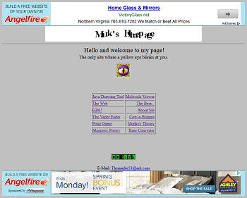
Facebook founder Mark Zuckerberg’s first website was recently found to still be online at Angelfire, an early free web hosting site. The Internet Archive confirms the site existed in its current form back in 1999, and the page’s source code is noted to be authored by “Mark Zuckerberg”. In addition, the author states they’re 15 (the age Mark was in 1999), and that they live outside of New York City (where Mark lived when he was 15). Motherboard provides further evidence, showing that the primary AOL account for the email listed on the site is a name commonly used by Mark Zuckerberg’s father.

The site screams 1999 web design, and is a very cool piece of internet archaeology. It should also be noted that it’s actually a pretty decent effort for the time for a 15 year old (you only have to see the About section of this blog to see my effort at 16). However, the most interesting aspect of the site is “The Vader Fader”, an AOL add-on application that Zuck was heavily promoting on the site. Did this mean he was apart of the AOL add-on community? Did he use AOL progs? Did he develop in Visual Basic?

vader

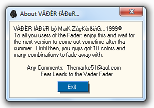
I downloaded The Vader Fader, and it is for AOL, and it was indeed written in Visual Basic. I tried firing it up, but got a message box saying I needed to be “online” and then the window on the left popped up. Ugh, I just want to see what this app looks like, I have to have AOL open? So I hunted down a version of AOL 4.0, installed it, and then tried running the app again. This time I got a runtime 6 error – this was most likely caused by Zuck using Integers to store window handles instead of Longs. After Windows 98, window handles started being Longs instead of Integers.

Being persistent, I decided to download Windows Virtual PC and load up Windows 98. After burning AOL 4.0, The Vader Fader, my API Spy, and a hand full of VB dependences to CDs and then loading them up on the OS, I fired up The Vader Fader. This time it didn’t crash, but it still told me I needed to be online. Crap… how was I supposed to do that? I tried signing on, to see if by some fluke AOL was still active and letting random people sign in, but it didn’t work. It then occurred to me – how did progs back in the day determine if someone was signed on? I couldn’t believe I remembered this, but the way it worked was the app would find the main AOL window, and then look for a child window that had a caption that started with “Welcome, “.

I used my API Spy to change the caption of the existing AOL sub-windows to “Welcome, PAT or JK”, and then tried launching The Vader Fader again. This time it worked! Well, sort of. Instead of a message popping up, the caption of the main AOL window changed to “The Vader Fader”, and then nothing happened. I poked around, and the app was running in the background, but there was no main window and it didn’t appear to have done anything else. My best guess is the app worked by augmenting AOL chat rooms and IMs with fading options (why else would it change the main AOL window’s caption?). If that’s the case, there really wouldn’t be much to see, or really any way to see it – given that AOL 4.0 chatrooms and IMs are long defunct.

I was a little sad, but glad I’d at least gotten the app up and running. I also ended up digging through the app’s machine code a little for any other clues on how it was created, but didn’t really find anything interesting (other than the 10 color choices). Since the app used the same online detection mechanism as most other apps at the time, I wonder if Zuck used a common bas file like dos32.bas or genocide.bas – that’d be pretty cool if he did. It’s also kind of neat that the main app he was pushing was a fader, since that was the first app I released on this site. Anyway, I’ve spent way too much time on this. The site is a cool piece of internet archaeology and definitely worth poking around a bit if you have a few extra moments.

Facebook User Identification Bug

Time for Round 2

I decided to take another shot at Facebook’s Security Bug Bounty program. This time I ended up finding a bug that allowed a website to use Facebook to detect if a visitor was a particular person. After doing a write-up and submitting it to Facebook’s security team, I was awarded a $1,000 bounty. Below I’ll go into how I came across the issue and how the technique worked. Also, I don’t see myself going full-on bug hunter after this or anything like that, this has mostly just been a random side-adventure that came from me being inspired by some random blogs I read on bug hunting and application security.

How it worked

I noticed that the preview-image for a Facebook Badge was dynamically generated based on a user’s Facebook ID. There were some other configuration parameters, but for simplification, you can imagine the HTML looking something like this:

<img src=”https://facebook.com/badge_edit.php?id=12345″ />

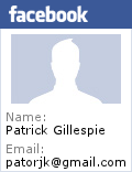
When rendered, the image would look something like Figure 1. Since it could contain a user’s email address, my first instinct was to see if I could load other users’ badge previews and get their email addresses. However, when I tried this, a Facebook logo image loaded instead of the profile image (Figure 2).

Figure 1

Figure 2

This meant that only the user themselves could view their profile badge preview. However, even though the logo was put in place to block information from being leaked, I realized that it still leaked information. An external website could use JavaScript to silently load tons of profile badge previews with different user IDs, and then check their height and width. If one of these images loaded and it wasn’t the height and width of the Facebook logo, the website would know that that particular user was viewing their page.

This had a lot of interesting use cases. Someone could:

  • See if a particular acquaintance (boss, ex-girl friend, frenemy) was stalking their Facebook feed or reading their blog.
  • See if someone famous was visiting their site.
  • Track the actions of certain people.
  • Show different content depending on who was visiting.

The one limitation was that someone could only check against a list of certain people, but there are only so many people someone can know, and targeted attacks are for particular people anyway.

Submitting the Bug

It was 1am Monday morning when I found this bug. When I realized what I could do with it, I had a rush of adrenaline and stayed up another 3 hours coding up a proof of concept and submitting a bug report. I really should have just gone to bed and wrote the report the following day (I’m supposed to be in at work by 9am), but it felt sort of like when you’re on the last level of a video game and your mind is buzzing with “holy crap, I’m going to beat the game!”

Similar to my last report, it took around two weeks for a security analyst to get back to me, and similar to last time, I was told it was interesting but that they needed to check with their engineering team. I was a little worried at this response – however, I felt that this time I’d found something that was really cool. Hell, it’s something that I would be tempted to use.

About a week later I noticed the bug was fixed and I received an email asking me to verify the fix. I did a few tests and then let them know that everything checked out. Shortly after this I got an email from the security team letting me know I was eligible for a $1,000 payout and that I needed to fill out a W-9.

Final Thoughts

In addition to Facebook, I also tried the white hat programs of a few other sites, and even ended up making Google’s honorable mention list and earning Reddit’s white hat profile badge. It’s kind of cool to get little bit of recognition and pocket change for finding security holes, though part of me is unsure if it’s actually worth it, since it is a decent amount of work for no guaranteed return. However, overall I am glad I did it since I learned a little more about security and it felt great to score a few finds.

The Chrome Web Store Effect

It’s been about 5 months since I tried out Chrome’s Web Store for my Snake and Text to ASCII Art apps, and I figured I’d give an update on how putting them in Chrome’s Web Store has effected their usage.

My Snake game has sat around for about 4 years on this site, consistently getting an average of around 30-50 users a day. I originally wrote the game as a nostalgic tribute to my high school days, and it’s only undergone a hand full of updates since its initial inception. Since this site was getting around 6.5k visits a day, 50 visitors means the app was accounting for around 0.077% of the site’s total traffic. After placing the app in Chrome’s Web Store, the daily usage began to steady rise, and the app has recently been getting between 900-1,000 visitors a day on the weekdays:

Snake Stats

Holy crap, the Chrome Web Store is awesome! Even with the bagillion other Snake games listed in the store, traffic has gone through the roof, with daily usage up 2,000%! But what about the TAAG app, has it also seen such a meteoric rise in traffic? Interestingly, even though both the Snake app and TAAG app have a similar number of installs, TAAG hasn’t seen a noticeable rise in traffic:

TAAG Stats

Hrm, this is kind of interesting. My guess is that this discrepancy is caused by the following factors:

  • TAAG is a utility app and isn’t really something that’s used often.
  • There is a high volume of people trying out games in the Web Store (installing them, and then uninstalling them if they don’t like it).

It’s hard to be certain of what’s actually going on, but I found these results to be pretty interesting, so I figured I’d share. I had wondered if the Chrome Web Store would be a positive for web app developers, and so far, from my limited experience, it seems like could potentially be a big plus for web app developers, especially game developers.

Facebook Bug Hunting

Image By laikolosse

Facebook has a neat security bug bounty program where developers, hackers, security researchers, and random Joe’s can submit security flaws to Facebook in exchange for a monetary reward and a place on their White Hat thank you list. Their minimum payout for finding a bug is $500, and that number increases based on the severity of the issue you report. Recently I’d read about amounts as high as $3,000 and $3,500 being paid out, and while this isn’t a ton, it’s definitely a nice amount of pocket change.

Since I was on break with my newborn last month, I decided to take a stab at uncovering an issue myself. Finding bugs is more about being clever than it is about being smart, and I figured the surface area for security issues on Facebook had to be pretty big.

I started out my journey by setting up a couple of test accounts in the Facebook sandbox. At first I tried a number of broad attacks – generic CSRF attacks, generic XSS attacks, faking email headers when sending email to an @facebook.com address, and lots of other really obvious things. Nothing seemed to work, and Facebook seemed to be a more hardened application than I had originally thought.

Original Image By javier.reyesgomez

At this point most people would get bored and move on, but I’m a little more stubborn than most people. I regrouped and realized my current path was fruitless. What I really needed was focus. I needed to look at one feature and see if I could find a hole in it. After surveying the different privacy settings, I decided to see if I could get around the setting that allowed someone to hide their friends list from their friends.

I poked and prodded and looked at everything related to the listing of a user’s friends. Finally I noticed something odd about Facebook’s one of the ajax calls that was being made under the covers. I was able to get it to return an error if a certain user parameter wasn’t a friend or a friend of a friend. Hrm, this was interesting. This meant I could do a check to see if a user was my friend or a friend of one of my friends. I wondered if this check factored in friends that were hidden from me. I rearranged the friend relationships in my test accounts and tried it out. Sure enough, the check didn’t respect hidden friends. This meant I could check if certain people were on the friends list of friends who were hiding their friends from me. If I only had one friend hiding their friends list from me, I could definitively check if certain people were on their friends list.

I ran some more tests, and with the consent of my friend Joel, confirmed the issue on the production version of Facebook. I then wrote up a test case (an attacker friends a victim, the victim accepts the friendship but hides everything from them) and submitted the how-to steps to Facebook’s Security Team.

And then I waited. Two and a half weeks came and went. I began to think my submission had been ignored when a message popped into my inbox from Facebook’s Security Team. They apologized for the delay, were very polite, and told me they thought the trick was pretty interesting. However, they wanted to double check with their Privacy Team to confirm how certain behavior was supposed to work and then they’d get back to me. They also mentioned they were going through a large backlog of issues. This made me curious as to how many submissions they get a day. Interestingly, around the time of this email I saw another individual go public with a bug they’d found due to not hearing back about a report quickly enough.

I was hopeful after the first email. The trick allowed someone to obtain information about their friends that was supposed to be hidden. It wasn’t the greatest find, but it was a neat little trick. However, the following week they emailed me saying that while they thought it was a cool trick, they felt it was an acceptable risk and that planned updates they were rolling out would eliminate it anyway.

The wind came out of my sails, and I felt like the achievement had slipped through my fingers. I still applaud them for setting up such a system, and being able to work in a sandboxed version of Facebook to try out different techniques is really cool. However, I’m left with mix feelings. Though then again, if you’re bored and just want to try and hack Facebook, it’s a fun way to spend a few hours.

Update 2013/27/02: I got confirmation a few days ago of a 1k reward on another bug I submitted. I may do another post on it, or may just make a short update here.