Category Archives: Web Apps

Posts about web apps I’ve created or am working on.

Image Glitcher: An online glitch art editor

I’ve created a new app for this site that allows you to easily create glitch art: Image Glitcher

It’s a simple tool that combines an image preview with a hex editor that has segment highlighting for jpeg images. In the future I hope to support highlighting for other formats too. The idea is that you can more intelligently make glitches in an image file when you know what you’re editing.

I created a short video about the tool framed around the idea of what happens when you edit a jpeg in a text editor. You can watch the video below.

This video was a lot of fun to research. Weirdly the research phase has consistently been the most fun part of the video making process. Originally I was going to cover all of the main image formats in this video (jpeg, png, bmp, gif), but jpegs wound up being much more complex than I anticipated.

There’s also a lot of weirdness with the file type that I opted not to cover in the video (I wanted to keep things focused). For example, you’ll often hear that jpeg’s use the YCbCr color model (basically luminance + color), but that’s not mandated by the spec. It’s actually color space agnostic. You can actually create a jpeg where it internally stores the data as RGB values (though jpegs usually store the data in YCbCr).

You’ll also often read that the two most popular formats of jpeg – JFIF and EXIF – are incompatible with each other. This seemed really confusing to me until I saw the color coded segments in the editor. JFIF is determined by a JFIF APP segment following the SOI marker, and EXIF is determined by an EXIF APP segment following the SOI marker. Jpeg parsers should have little issue differentiating them. Though possibly even stranger, you don’t even need this segment in a jpeg. Wikipedia often strips it out.

Anyway, there’s a lot of random info I left on the cutting room floor. Maybe one day I’ll work it into something else.

Text to ASCII Art Generator: Version 3.0

Last month I silently released a new version of my Text to ASCII Art Generator (TAAG) app, along with a new TypeScript version of its underlying library. For those of you who are unfamiliar, TAAG is an app that takes in text and turns it into ASCII art. For this latest update I decided to go with a silent release because I wasn’t sure when I’d be done re-writing the app. In fact, I still have several updates I want to do to it, but I feel like it’s in a complete enough state to blog about.

TAAG was originally written back in 2007, when I was re-learning JavaScript. For the most part, the original app did what it needed to do, and prior to this latest rewrite, it hadn’t undergone any major changes since 2012.

So… if the old app was fine, why rewrite it? Well, there were two underlying reasons:

  • I wanted to modernize the code base to make it more maintainable.
  • There were a handful of minor features I wanted to add that weren’t really possible with the app’s ancient code base (ex: better Test All page, searchable selects, dark theme). 

However, I didn’t want to make any drastic changes. I wanted to maintain the same feel as the old version. For the most part I think I was successful, though I did receive one email bemoaning the changes since they really liked the retro feel of the old version. However, I think the more polished version will be better for the site in the long term. 

Modernization: TypeScript?

I don’t think I’ve discussed my thoughts on JavaScript vs TypeScript publicly before, but I used to be hugely pro-JavaScript. I loved the freedom it gave you, I loved how I could quickly create prototypes, and I loved how versatile it was. However, over the past few years I’ve had a change of heart. Navigating gigantic JavaScript code bases (100k+ lines) can make you lose your mind. I have a pretty high pain tolerance when it comes to crazy JavaScript code, but in recent years even I have reached my limits. 

After giving TypeScript another try (I used it years ago and it caused me more problems than it solved), I’ve found it to be hugely beneficial. It helps catch mistakes that would have gone unnoticed and it makes code easier to understand. I’ve slowly introduced it at my work, and it’s now starting to make its way into some of my personal projects. 

In Conclusion

There’s something satisfying about taking an 18-year-old app and giving it new life. Hopefully it works the same and feels familiar while being more solid under the hood. I have plans for additional features and improvements, but I wanted to get something out there because I get distracted easily.  I hope you like the updated app. If you have any suggestions just let me know in the comments.

Fake Like Buttons

This past weekend I updated my photography website to use MUI v5. The upgrade was mostly painless and while I was poking around I did a few other minor updates – the most fun being the ability to toggle Baltimore’s power grid on and off. I think I want to do more interactive stuff like this in the future. It’s only been up for a few days, but that light toggle is by far the most clicked thing on that site.

While I was mucking around in the code I also removed the faux like button that had previously accompanied each photo. The like button hadn’t been connected to anything other than my analytics, but it would shoot out confetti when clicked and fill-in to indicate that a like had been left. Why did I have fake like buttons on the site? Good question…

Back at the start of the year I had the following shower thoughts (those “profound” thoughts that only come to you while you’re in the shower):

  • Have like buttons become the dominant language of the internet? Do people click them to indicate they like something? Or is the clicking of a like button dependent on factors like the platform it’s attached to?
  • How often do people unlike things? And what would happen if a website became defensive and started arguing with you about taking away a like?

I found the second thought especially amusing and after laughing about it to myself I decided I would put something into my new photography website to test these ideas out. And just to be up-front – and before I get too far into this story – I’ll say that the results of this “experiment” weren’t very profound (as are most shower thoughts), but maybe it offers a few nuggets of wisdom somewhere.

Anyway, I launched the new photography site this past February and over a 7 month period 3,333 unique people visited it. On average they spent 1 minute and 13 seconds looking around and in total left 236 likes. This indicates to me that people don’t click like buttons to communicate they like something (my photos aren’t that bad, right? right??). The decision to click seems to be more nuanced. It could also be that people were suspicious of a like button that didn’t have an obvious association.

In retrospect this seems pretty obvious. When I click the thumbs up button on a YouTube video, I do it knowing I’m helping the creator and/or helping the algorithm so it can provide me with personalized recommendations. If I saw a random like button on a website I don’t think I would click it unless I knew what the side effects were.

The second part of the experiment produced another non-shocking conclusion: unliking is pretty rare. I had set things up so that if someone attempted to unlike a photo, the site would popup with a notification letting them know they must have made a mistake and not to worry, the photo was still liked. If the user continued to press the like button, the site would become increasingly frustrated in its notifications to the user until finally calling them a filthy bastard and letting them unlike the photo. 

I laughed at the thought of this happening and after I launched the new site I checked my stats every few days to see if such an event had occurred. I figured that after it happened a few times word would get around and I would see a whole bunch of unlike events in my analytics. However, no such thing happened. After a month I realized that unliking something is a very rare and if I ever wanted a chance of someone seeing my gag I would need to make some alterations. To help with unlikes I decided to add a confetti explosion animation to the like button. I figured some visitors would want to see it more than once, leading them to unlike and re-like a photo.

Over the course of 7 months, 27 unlike events occurred, and only 11 of those made it to the final message (which took 6 clicks). Nearly all of these were me, so this gag was maybe too confusing and too hard to find ?.  As for the remaining 16 unlikes, I assume that most of those were people who just wanted to see the confetti animation again. These people were probably super confused by the message that popped up, and they probably thought I was some super sensitive prude or something. In hindsight, it does seem like an odd gag to put in a fine art photography website.

If there’s anything I learned from this it’s probably that unlikes are rare and that people like with intension – they aren’t going to click something if they don’t know what it’s for. What started as something that had me laughing in the shower ended with me realizing I had made something that was amusing only to me. I suppose it’s probably best to leave shower thoughts at the shower.

Using Dithering to Create Old School Gaming Filters

Recently I’ve been reading up on image dithering. It’s kind of cool. It’s a way of transforming an image into a smaller color space while still simulating as much color depth as possible. It has lots of practical uses – printing, displaying images on screens with limited colors, etc – but I realized it could also be used to inject images a heaping dose of gaming nostalgia. I couldn’t resist doing a quick proof of concept, so I’ve created a new web app that will transform an input image into what it may have looked like on an old gaming console by way of various dithering algorithms. For example, below you can see what I may have looked like on a Game Boy.

As you can probably infer from what I said previously, the app is actually pretty simple. All it’s doing is resizing the image and applying an image dithering algorithm to it.

There are various image dithering algorithms, but most work by trying to intelligently add noise to areas of an image where it doesn’t have the right colors in its reference palette. This noise can help simulate the missing colors. One place you may have seen image dithering is in gif files, which typically have small color palettes. In fact, the noise you see in many gif files is commonly due to the dithering algorithm that was applied to it. Without dithering, these files would suffer from color banding, which can be pretty ugly. In the video below you can view comparisons of what undithered vs dithered images look like given color palettes of various sizes.

As you can see, dithered images are able to look much better with far fewer colors. For the new app, I chose to use the popular Floyd-Steinberg dithering algorithm for most of the results (and used the wonderful RgbQuant.js library for this), and also used Ordered Dithering for a few other cases (I couldn’t find a good implementation of this algorithm, so I just wrote my own version based on what I read here). If you play around with the app, you’ll notice that the results with ordered dithering are much worse. I only included this option because it appears to be what the Game Boy Camera used. I’m not 100% sure on this, but the cross-hatch pattern found in many Game Boy Camera images is indicative of ordered dithering.

I should also note that while the new app can give you an idea of what an image may have looked like on an old gaming console, some of these filters wont be exactly 100% true to life. For example, the NES is capable of displaying around ~54 different colors, but for a single sprite it could only display 4 colors. So it wouldn’t really be realistic to expect an NES to display an image like this:

For it to display that image, it’d have to be composed of a bunch of tiny sprites that overlapped, and I’m not sure if there would be any limitations when doing that. So these filters are really just best guesses, and mostly just for fun.

Lastly, I’ve also put in an option to create output without dithering. In some cases this produces a more realistic gaming result, and sometimes combining dithered and non-dithered images can give a better result, like this Sonic image: (I combined the dithered and undithered versions in photoshop, masking in the areas I liked from each version).

Honestly I’m not sure what practical use this app can have other than maybe a few minutes of fun, but I hope you enjoy it. If you’re interested in learning more about dithering algorithms check out this blog post on the subject, it covers in detail how several of the more popular ones work.

  • Check the app out here: Old School Gaming Filters
  • Create your own filter here: Palette Swap (this was actually my original idea, but it takes a little more work and I found pre-made filters were a little easier to work with)

Creating a d3.js Game of Thrones Visualization

For any Game of Thrones fans out there, I’ve created a neat little interactive visualization. It ranks characters by how many episodes they’ve been in, makes note of who’s alive and who’s dead, and allows you to go backwards in the show’s history to see how things have developed over time.

It also reveals some interesting stats:

  • After 40 episodes, the show has around ~140 notable characters.
  • The show seems to kill an average of 13 notable characters per season, or 1.325 per episode.
  • 37.1% of the notable characters have been killed off so far.

You can see a spoiler-free version of the visualization below (character avatars and death information has been removed):

d3_got

The chart is written on top of d3.js, which is a web-based visualization library. I learned how to use it earlier this year and have been on the lookout for projects I could use it for. After seeing the bubble chart from Matthew Daniels’s Largest Vocabulary in Hip Hop visualization and noticing it was based on an example by Amelia Bellamy-Royds, I decided to see if I could create my own bubble chart.

D3 Context Menus

I didn’t see any d3.js context menu plugins while doing this project, so I wrote my own. I could have used a jQuery plugin, but I wanted to keep as much of the code within the D3 way as possible (it just made working within their event structure easier).

Other Game of Thrones Visualizations

So there’s are plenty of other Game of Thrones visualizations out there. If you’re looking for more, I’ve compiled a short list below of some of the best ones I’ve found.

  • Events in the Game of Thrones – A visualization of the events from the first 5 Game of Thrones books.
  • Game of Thrones Map – Interactive map of the Game of Thrones universe.
  • Beautiful Death – A piece of artwork drawn for each episode in the show. I’m not sure if this technically counts as a visualization, but they’re pretty cool.

TheDraw’s Lost ANSI Art Fonts

audio_book

Sample ANSI art by Roy/SAC

Most people know what ASCII Art is – its art created by arranging text into pictures. ANSI art is also text art, but it’s a little more special. It allows you to create text art that includes additional text characters, color, and limited animation. It gained popularity in the tech underground of the mid-80’s, and a community of artists emerged and flourished. It’s hay day was short lived though. In the 90’s unicode became the standard for encoding text, and since ANSI Art was based on IBM’s extended ASCII* character set, its presence became more and more uncommon.

These days the most editors can’t open ANSI Art files. If you try to view them they just wind up looking like gibberish. This doesn’t mean the art form is dead though – fans of the genre have gone out of their way to create special editors and viewers so that the art can still be appreciated, but the community is much smaller than it once was.

The Lost Fonts

About a year ago, someone named Aaron Haun sent me a zip containing over a hundred user created ANSI art font files from an old DOS app called TheDraw. He thought I might be able to provide a place to preserve them since I’d done so for the AOL Macro fonts. The only problem was neither of us knew how to decode the files within the zip.

audio_book

Aaron’s ASCII Tattoo

Armed with copies of TheDraw and ACiDDraw, I decided to do some ASCII archaeology. I ended up going through the same rigmarole I did when I was trying to get Mark Zuckerberg’s Vader Fader to work, and was able to load up the old DOS apps on a Windows 98 virtual machine. This unfortunately didn’t help much, but it was cool to see the old apps in action.

After some more research, I learned most of IBM’s Extended ASCII characters had unicode counter parts. Since unicode is easy to display, I wrote a script to process the font files and return unicode compatible versions. This script also stripped out the color information. Though I felt the colors were neat, I couldn’t figure out how TheDraw was encoding them**.

What was left were some pretty neat ASCII fonts from the late 80’s / early 90’s. Created for use in emails and on old BBS systems, today it appears these fonts have mostly disappeared from the internet. After talking with Aaron, the only two sites that appear to host ANSI art font files are archives.thebbs.org and slbbs.com, and in both cases you’ll need a special ANSI art viewer. Aaron told me he originally grabbed the font zip from ASCII Artist Roy/SAC’s web page (roysac.com), but that site appears to have been shutdown a year ago. Roy/SAC does still have a deviantart page though, and you can see what his site used to look like at the internet archive (NSFW-ish).

With the fonts in hand, I decided the best thing I could do was convert them into FIGlet fonts so people could once again start using them. I created simple web-based FIGlet Editor to assist in the process, and ported over the fonts I felt looked best going from ANSI to FIGlet. Sadly this means I only ported over a hand full (10 total), since a lot of ANSI’s charm is in its color. Plus, even with the decoded files and my editor, it took a decent amount of time to make the fonts.

You can see what the ported over fonts look like in the screen shot below or you can browse the “ANSI FIGlet Fonts” section of TAAG and use them yourself. Later this week I’ll also add them to the figlet.js repo if you want to download the individual figlet files.

You can see what the originals look like on Roy/SAC’s old font page (internet archive link). At some point it might be interesting make something that would show the ANSI fonts as they once were, but for now I thought it’d be cool to at least provide a way to use some of them in a stripped down form.

More ANSI Art

Notes

* This is somewhat confusing because there’s an extended version of ASCII known as ANSI that was done by Microsoft. This leads me to believe that the name ANSI art was a mistake that wasn’t noticed until it was too late (plus “IBM Extended ASCII Art” doesn’t have much of a ring to it). Making this even more convoluted, Microsoft’s ANSI character extension was never standardized by ANSI, so it makes no sense to call it ANSI in the first place.
** TheDraw didn’t encode colors with ANSI escape codes.

2014.01.22 Edit: I updated the font screen shot to include all of the fonts instead of just 4.
2014.05.18 Update: Roy/SAC has recently relaunched his site and created a neat tool for working with fonts from TheDraw.

Random Updates for October

Over the last month I’ve done a lot of little updates. Now that the government is shutdown and I’m just hanging out at home, I figured I no longer had an excuse not to write them up.

If you let them build it, they will build it

I added the ability for users to submit presets to the Keyboard Layout Analyzer and the feature ended up being reasonably popular, with users creating and submitting lots of neat configurations. However, I was lazy in implementing the feature, and made it only partially automatic. Once a layout is submitted, I’m emailed the code I need to add to the config.htm file. This works out fine, since I only get about one or two submissions a week.

Since that feature worked out great, I decided to add a similar feature to the Text Color Fader, except instead of layouts, it was color presets… and oh did my laziness come back to bite me. It was originally setup to email me the code I needed to add after each submission, but after a week of getting 20-30 emails a day (and discovering that most submissions were just people testing out the submission feature), I realized I’d made a grave mistake. I went back and re-wrote it to include a proper admin panel and submission database. Now I just get a few emails a day and can easily approve/disapprove submissions. This approach definitely doesn’t scale, and with the number of presets growing daily, neither does the combobox I’m using on the front-end. However, I feel like I’ve bought myself time, and at the least there’s a neat color preset database that’s being compiled (users have submitted some very nice presets).

Ergodox Layout

When I originally overhauled the Keyboard Layout Analyzer, I put in support for different keyboard configurations – however, I never really showed this feature off. After getting a request to support the Ergodox layout, I knew I had an opportunity. I created a “key map” for it and uploaded it into the app. Within days users had submitted a number of nice alternative layouts for it, which was really cool to see.

The Years We Spend on YouTube

I read an interesting fact the other day. It stated that if you added up all of the views of Psy’s Gangnam Style, it would equate to over 13,000 years of human viewing time. I thought it was a pretty trippy concept, and since I’d sort of been looking for a reason to play with YouTube’s API, I thought it might be kind of cool to make a quick app around the idea.

You can see it in action here – Years Spent Watching YouTube.

Let me know if you have any suggestions for example videos.

Keyboard Layout Analyzer 3.0 Beta Release

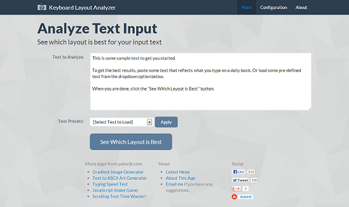
I’m not completely done, there are still a hand full of new features I want to add, but I have a feeling that if I put off the update any longer, it’s never going to get posted up. So today I’m releasing the newest version of my Keyboard Layout Analyzer (KLA), which I’m dubbing version 3.0, since it’s the 3rd overhaul of the layout.

kla

New features:

  • Analysis results can be shared.
  • Charts are interactive / contain hover effects.
  • There are more “Display” options in the various results sections.
  • You can turn on/off certain keyboard data in the individual results sections.
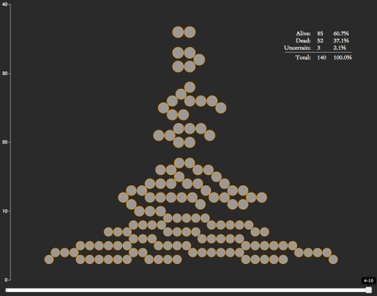
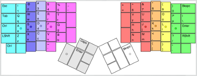
  • The heatmap uses a more realistic heatmap visualization, has a table of key stats, and I’ve re-added in the mouse over effect (the biggest complaint in my previous version was that I took this out).
  • Miscellaneous section has charts for each piece of data.
  • Layouts you create can be submitted.

The biggest change though is the UI. The main reason I created this version was because I thought it would be a fun project to get better familiar with AngularJS. MV* JavaScript libraries like Angular have taken off recently because they make maintaining, updating and reusing front-end code easier. I felt the code I wrote for version 2.0 of KLA got a little spaghetti-ish at points, so this really appealed to me.

To keep things short, I’ll go ahead and just cut to the chase: Angular lived up to its hype. It was great at giving structure to the app. The new KLA code base feels a lot more sane and the HTML is easy to follow. If you do front-end development, I’d highly recommend you try Angular out. If you need a starting point, egghead.io has some great tutorial videos and Dan Wahlin has a really nice AngularJS Fundamentals video. And as a side note, even though Angular’s official documentation is good, I wouldn’t start there. I found it to be somewhat cryptic when I first started out. It’s a good reference point after you’ve gotten your feet wet though.

The only negative I came across with Angular was that it had a steep learning curve. I ended up having to back track a few times and re-do sections of the app because I didn’t do them the “Angular way”. Angular forces you re-think how to do certain actions and it uses some strange terminology, but once you get past all of that, it’s a pretty powerful tool.

Removing JK.js

My early days in JavaScript reminded me of an old puzzle game called The 7th Guest. In The 7th Guest, if you had trouble solving one of the puzzles, you could ask for a hint from the library. After getting 3 hints, the puzzle would be solved for you, but you’d miss the video that was shown after completing the puzzle, therefore missing a part of the game’s story. If you missed too many videos, you’d have no idea what was going on.

When I first started learning JavaScript, I kind of felt this way about third party libraries. I didn’t mind using ones that provided UI components, but I felt I’d be missing out on something if I used jQuery. So I wrote my own jQuery-like utility library called JK.js, which I used in my personal projects. However, I no longer feel like I’d be missing out on anything by implementing low level utility functions. What I really care about is writing an app, not a library. So as I’ve been refactoring my projects, I’ve been removing JK.js and replacing it with jQuery.

Flatly

Bootstrap makes it easy to create nice looking web pages. I decided to use an awesome Bootstrap theme someone created called Flatly, though I tweaked the colors a little bit. I also used an image from subtlepatterns.com as the background to make it feel a little livelier. However, while Flat is cool looking, I worry the result may be a little too flat, so at some point I may backtrack.

jqPlot

The charts in my previous KLA versions used a modified version of PlotKit. PlotKit was a good library, but it hasn’t been maintained in years. On top of that, my modifications to it used my own JS library JK.js, which I wanted to weed out, so I knew I needed a new chart library if I was to redesign this app. I decided upon jqPlot since it was jQuery-based and had a lot of great functionality. So far I’m pretty happy with it.

Heatmaps

I came across a neat visualization library for heatmaps, so I decided to use that over the simple key-color heat maps I was creating before. Interestingly, the author of this library also has his own keyboard heatmap app. When I saw this I felt a little weird about using the library – but since the heatmap library was its own separate component, I figured it wouldn’t be too weird if I used it too.

Future Updates

I still a have more features I want to add, ones that will be more stat based, so hopefully there’ll be another update in the next 2 weeks or so. I also may update my Typing Speed Test to use this same type of layout (it’s in dire need of an update). If you have any feature requests let me know. Special thanks go out to Wayne D. for submitting a bunch of awesome ideas and feed back!

The Chrome Web Store Effect

It’s been about 5 months since I tried out Chrome’s Web Store for my Snake and Text to ASCII Art apps, and I figured I’d give an update on how putting them in Chrome’s Web Store has effected their usage.

My Snake game has sat around for about 4 years on this site, consistently getting an average of around 30-50 users a day. I originally wrote the game as a nostalgic tribute to my high school days, and it’s only undergone a hand full of updates since its initial inception. Since this site was getting around 6.5k visits a day, 50 visitors means the app was accounting for around 0.077% of the site’s total traffic. After placing the app in Chrome’s Web Store, the daily usage began to steady rise, and the app has recently been getting between 900-1,000 visitors a day on the weekdays:

Snake Stats

Holy crap, the Chrome Web Store is awesome! Even with the bagillion other Snake games listed in the store, traffic has gone through the roof, with daily usage up 2,000%! But what about the TAAG app, has it also seen such a meteoric rise in traffic? Interestingly, even though both the Snake app and TAAG app have a similar number of installs, TAAG hasn’t seen a noticeable rise in traffic:

TAAG Stats

Hrm, this is kind of interesting. My guess is that this discrepancy is caused by the following factors:

  • TAAG is a utility app and isn’t really something that’s used often.
  • There is a high volume of people trying out games in the Web Store (installing them, and then uninstalling them if they don’t like it).

It’s hard to be certain of what’s actually going on, but I found these results to be pretty interesting, so I figured I’d share. I had wondered if the Chrome Web Store would be a positive for web app developers, and so far, from my limited experience, it seems like could potentially be a big plus for web app developers, especially game developers.