Category Archives: Web Apps

Posts about web apps I’ve created or am working on.

Dogs Days of Summer and Web App Versioning

Rising Sun

Rising Sun

I can’t remember a time when I was so exhausted. I’ve moved into my new townhouse, though it still feels like there’s a ton of stuff to do for it. I also got engaged recently, and even though the date is a year away it seems like there is a lot to do for it. I’ve also been working 50-55 hour weeks at work the past few weeks, usually leaving work around 10pm. That last one isn’t too bad, since I’m getting overtime and I know people who’ve done much worse (I have a friend who told me he once did a 27 hour a day). However, it’s all left me a little worn out. However, I’ve still kept this site in my thoughts.

One behind the scenes thing I decided to look into was web app versioning. Sometimes I want to make a small update a program like Text Ascii Art Generator (TAAG), where I might need to change 3 or 4 files, yet if the user has certain files cached, the mish-mash of certain new and old files could cause the program not to work. There may be some obvious way of doing versioning that I’m just not aware of, but its something that’s bugged me for a while. I had been getting around this issue by naming the files I wanted to update something different (ex: font-settings-v1.htm became font-settings-v2.htm, etc), however, this seemed a rather messy way of doing it.

Recently I decided to put the whole app except for its index.htm file under a directory representing its version, and having the index.htm point to the sub-directories under the latest version. So the apps contents would be placed in a structure like this:

patorjk.com/software/taag/1.0.0/pages/ – Pages for the app
patorjk.com/software/taag/1.0.0/css/ – CSS files
patorjk.com/software/taag/1.0.0/scripts/ – Scripts
patorjk.com/software/taag/ – Where the index.htm file would go

This is nice because it allows me to go back in time if I screw something up. For example, if I decided I didn’t like version 1.0.1 of the app, I could go back to version 1.0.0 by just changing the index.htm file. This method also prevents any kind of awkward file combination due to cached files. However, it’s down sides are that I have to upload a whole new version of the app every time I update and I need to make sure users aren’t linking to or bookmarking pages underneath the version sub-folder. The app has to be set up so that the version folder is invisible – everything has to happen through the page at the base directory. This is so search engines wont index every single little version of the app.

So far this system seems to work pretty well, however, if anyone has any suggestions let me know.

In the weeks to come…

I imagine my free time to be kind of scarce for a while, but I have some ideas I want to work on, so updates will keep coming, but probably in a more sporadic manner.

Lots of Typing Speed Test Updates Today

Last time I said I had two more major features that I wanted to add into my Typing Speed Test. That number has since ballooned quiet bit and now I’m not really sure when I’ll be done with it.

Om Nom Nom

Random Pro-FF Image

The biggest change you’ll notice today is that the input text is now in a 3-line format that scrolls once you’ve typed to the end of the second line. I like this change a lot sense I think it allows for a more simple user experience.

Another reason I like it is that it allowed me to find my first undocumented (for the most part) bug in IE (well, the first one that I’ve taken the time to examine). It appears IE has issues with returning the correct offsetTop position of span tags in certain situations. I’ve set up a test page here that’ll show you different offsetTop values when you use IE as opposed to other browsers. This guy had similar issues, though he couldn’t reproduce his problem via a test case. Luckily for me, his offsetTop span solution also worked for what I was doing (just set the span’s position property to relative).

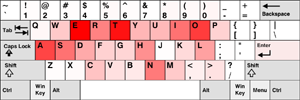
My hot spot visualization after 1000 words of Moby Dick. I got kind of tired.

My hot spot visualization after 1000 words of Moby Dick. I got kind of tired.

Since the input text can now be scrolled in a smaller area, I’ve also added in some additional test time options. You can now run the test for up to 5 minutes or up to 1000 words. I will warn you though, typing the 1000 word version of the test more than twice in a row will leave you kind of sore.

A lot of the other changes I made were under the hood changes. To decrease loading time, I’m now using the YUI Get Utility for certain script files. This utility allows developers to grab script and css files at run time and integrate them into their code. Right now I’m using it to grab unloaded script files that contain functions that return input text for the typing test. I figured that most users aren’t going to try every possible test input, so there’s no reason to load them all each time. It doesn’t improve loading time a whole lot right now, but it’ll keep the loading time from growing once I start adding lots of different test inputs.

I’ve made a bunch of other minor changes and fixes, but I wont bore you with all the little details (unless you want me to). If you find any problems in this new version please let me know.

How Fast Do You Press Each Key When You Type?

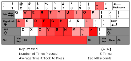
I’ve updated my Typing Speed Test with a new feature that lets you see how fast you typed each key on the keyboard. Once you finish the test, you’re presented with a visualization of the keyboard where the keys that were typed faster are more red and the keys that were typed slower are less red. Keys that are completely white were not typed at all and grey keys aren’t factored into the calculations. To see stats about an individual key, all you have to do is mouse over the key you’re interested in. Below you can see a screen capture of the feature.

A screen capture of the Hot Spot Visualization feature. The mouse was hovering over the W key when this shot was taken.

A screen capture of the Hot Spot Visualization feature. The mouse was hovering over the "W" key when this shot was taken.

Let me know if you see any problems. I still have two major features I want to add into this app before I move onto my next project.

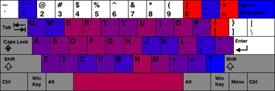
EDIT March 26, 2009: I’ve updated the visualization. Blue now represents key that were typed slowly and red represents keys that were typed quickly.

How Fast Do Your Individual Fingers Type?

Some big updates were made to my Typing Speed Test. I’ve spent the last two weeks brainstorming and implementing ideas I thought would make it more useful. Once I found I could easily capture the speed at which the keys were typed I realized that this also meant I could deduce how fast each finger was moving.

However, to be able to accommodate Dvorak and Colemak users, I had to make the user’s keyboard layout one of the configuration items. I also realized that not everyone types according to the standard fingering positions, including myself. I noticed this back when I was learning the Dvorak layout. My right pinky kept getting really sore. When I switched back to the QWERTY layout, I noticed that the only keys I used my Right Pinky for were the “Enter” key and the “Right Shift” key. To accommodate the people who deviate from the norm, I also made it so users could manually set which fingers they used for each key.

Allowing users to change the normal Finger-to-Key mapping lead to some hard user interface decisions. What I ended up creating was a keyboard map where the user changed a key’s mapping by clicking it one or more times. When it’s clicked, its mapping goes to the next finger in the legend. I initially had a design that used radio buttons, but I didn’t like all of the back and forth movement it caused with the mouse. I’m still not sure I have the best design, but for now I think what I have works fine. Below you can see an picture of the user interface. The keys are set with the finger positions I typically use.

My Custom Keyboard Finger Positions

My custom keyboard finger positions.

Once you finish the test you’ll now be presented with stats on how well you typed and stats on how fast your individual fingers were. To make the test more blog friendly, I also decided to present the user with the HTML code for the output tables. Below you can see two of my tables from a run I did.

Typing Stats
Words Per Minute (WPM): 76
Characters Per Minute (CPM): 378
Words Correct: 32
Words Incorrect: 0
Fastest Finger: Left Pinky
Slowest Finger: Left Ring
Keyboard Layout: QWERTY
Test Duration: 30 Seconds
Stats From PAT or JK’s Typing Speed Test

Average Finger Response Time
Left Pinky: 119 milliseconds
Left Ring: 228 milliseconds
Left Middle: 158 milliseconds
Left Index: 206 milliseconds
Right Index: 135 milliseconds
Right Middle: 128 milliseconds
Right Ring: 188 milliseconds
Right Pinky: N/A
Thumb(s): 100 milliseconds
Stats From PAT or JK’s Typing Speed Test

I should note that the finger speeds are based on all of the key presses you make and not just on the ones that lead to correct words. Also, FireFox seemed to be able to detect Backspace key presses while IE did not.

I still have a bunch more ideas that I want to add in, but I haven’t gotten to them yet (like the hot spot visualization I mentioned in my last post).

If you find any errors or bugs let me know. You can post them in the comment section of this post.

My First Try At Revamping My Typing Speed Test

I’ve just updated my Typing Speed Test. I basically just implemented the changes that people suggested to me. These included:

  • Allowing the user to type real sentences, for example, stuff from books.
  • Adding more text input options.
  • Cutting the default time down from 60 seconds to 30 seconds.
  • Not having the text scroll as the user types and letting the user see all of the text they will have to type.
  • Highlighting of the correct, incorrect, and the current word in the box displaying the text that needs to be typed.
  • Providing obvious instructions on what to do.

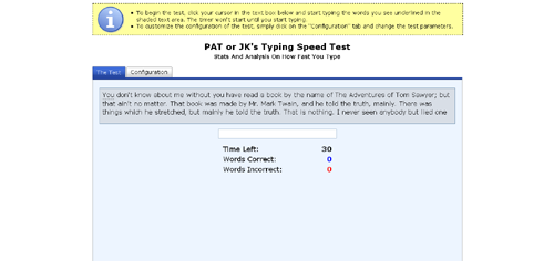
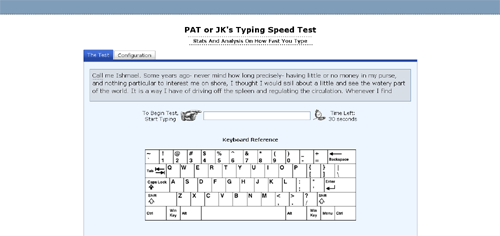
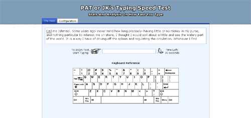
I was unsure about how to display the instructions, so I just put a yellow information box at the top of the page. The only other thing I could think of was to start the app with a Ext JS-style message box, but I figured that would get really old after a while. Also, the spacing at the bottom of the page is kind of weird because I wanted the tab sizes to be static. I’m not sure if that’s the best design idea, so that may change.

A possible visualization indicating which keys were typed fastest

A possible visualization indicating which keys were typed fastest

For the next release, I’m thinking about adding in more stats on how fast the user types. Maybe giving them info on what keys they typed fastest via a visualization or some bar charts. A line graph showing their progress over time might also be cool. However, JavaScript may not be fast enough to let me do this. While beta testing today I noticed that sometimes I almost got ahead of the app, and keeping lots of extra stats may slow things down too much, I’ll have to see though.

Thank you to those of you who gave me suggestions. I think the test is much, much better now.

If anyone has any more suggestions or finds any problems please let me know!

Oh, and one last news worthy item, I also updated the About page on this blog with some more info and pictures.

Reading Up On Javascript

Shortly after finishing the beta version of my Typing Speed Test I started to feel like my knowledge of Javascript had some holes in it, especially in the event handling area. It’d been a long time since I’d read a book on Javascript, so I figured I’d pick one up one to help fill in the holes in what I knew.

I looked around a little bit before selecting “ppk on Javascript”. I chose this book after reading some of the author’s online articles. They were easy to read and contained a lot of interesting tidbits. I don’t want to turn this entry into a book review, so I’ll just say I enjoyed the book and would recommend it. However, the book admittedly doesn’t cover certain topics like OOP in Javascript. Though even with its omissions, it still ended up covering a lot of ground. The major things I took away from the book were:

  • Event Bubbling vs Event Capturing – I feel bad I didn’t know about this. It answers the question: If an element and one of its ancestors have an event handler for the same event, which one fires first?
  • location.href vs location.replace – It’s best to use “replace”. This is because replace doesn’t create a new history entry in the visitor’s browser. This is a good thing, since you don’t want to make a user’s back button useless.
  • The navigator.userAgent string has an amusing story behind why its value is so convoluted.
  • getElementsByTagName – I didn’t know about this DOM function. It looks like it could be really useful though.
  • DOM Tree Text Nodes – When you create an HTML document, the text between tags and the text inside of a particular tag become text nodes. IE doesn’t support empty text nodes while other browsers do, this appears to make modifying the DOM tree a pain.

There were other things too, but those are what stick out in my head while I type this. I’m really glad I read that book. It reminded me of how useful programming books are (I had gotten too use to just Googling whatever I didn’t know).

Right now I’m a little more than 50 pages into “Pro Javascript Design Patterns”, which covers design patterns and OOP in Javascript. So far it’s really good. I had been meaning to read up on design patterns for a while so I’m pretty excited about this new book. I’m averaging almost 20 pages a night, so I should finish up pretty quickly. Once I finish, I’m going to get back to creating content for this site. I may make some posts in the meantime, but I figured I’d give you all a heads up as to what I was doing so you didn’t think I had forgotten about this site.