New Keyboard Layout Analyzer, Less Lines of Code

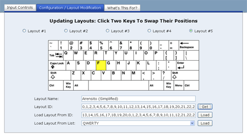
I’ve uploaded a new version of my Keyboard Layout Analyzer. You can see a full screen capture of the output page below. The new version has a layout similar to the one I discussed in my last post, and has a different chart set up, as well as a hand full of other small new features.

The New Layout For Keyboard Layout Analyzer Output

The New Layout For Keyboard Layout Analyzer Output

This new version is essentially a complete re-write of the old version. I had been making mental notes of features I thought would make the program a lot more useful, and after thinking about how I’d implement these new features, I realized I’d be better off just re-writing the application instead of modifying the old one.

This re-write was also a way for me to “pay down” my “technical debt” (I think I like that term), as I was able to more efficiently implement certain things to make them a lot more flexible. When I write stuff for fun, a lot of the time I just go with the first or second implementation I think of and then get to work. This re-write will probably serve as a good lesson learned, since the re-write was a little more painful than I expected. Only one of the new features that I thought up is in the program right now (the new chart set up), I didn’t have time to get to the rest of them, though I hope to implement them in the next couple of weeks.

Here’s an overview of what’s in this version:

  • Updated interface.
  • Able to view charts of different layouts all at once.
  • Able to select what pieces of information you want to factor into the charts.
  • Addition of the Capewell and Arensito (Simplified) layouts. However, this set up isn’t final. These layouts will still be in the next version, but the options will be a little different.
  • “Personal Layout” factored into the statistics.
  • A layout recommendation is made based on what you typed.

This new implementation also consists of 26% fewer lines of code. 🙂

This new version was tested out in Firefox 3.0 and 3.5, Chrome, and IE8. Unfortunately, the new IE8 messed up my install of IE6Eolas, so I’m not sure how the app works in IE6 or IE7. Oh, and I hate to rehash the clichĂ© of bashing IE, but IE8 is actually a lot slower than IE6 and IE7 when it comes to executing JavaScript. Enough so that I was actually a little dismayed. I had been hearing mostly positive things about IE8, but I just didn’t see anything that I thought was that impressive.

Anyway, if you have any suggestions for the Keyboard Layout Analyzer or find any bugs in it let me know.

The Evolving Layout Of The Typing Speed Test

Coming up with a good looking, easy-to-use design is hard. Sometimes I feel like I spend more time trying to design an application’s layout than I do programming its back end, and most of the time the resulting layout isn’t that impressive. I think I’m just better at creating functionality than I am at making something that looks pretty. However, no one’s going to look at something if it looks like crap, and people tend to give applications more of a fair shake if they look nice, so I think the time I spend trying to become a better designer is worth it.

Recently I’ve taken to trying to improve the look of my Typing Speed Test. Below you can see the initial design, a design I put up last month, and the most recent design, which I put up this past weekend.

Initial Design

Initial Design

Second Layout

Second Layout

Current Layout

Current Layout

I made the initial design with the idea of keeping things as simple as possible, however, in retrospect, the page looks kind of unbalanced and the big yellow explanation box at the top kind of comes off as a little bit of an eye sore. The second layout was made with the aim of being a bit more stylish. I got ride of the yellow explanation box, threw in some small gifs, added a keyboard reference, and put in a header bar to make it seem a little less plain.

The third, and current layout, was made with the aim of trying to make something that, in my mind, looked good. I don’t think I quiet accomplished that, but I think I came up with something better than what I had. The interface seems cleaner and more balanced, and I like the additional color at the top of the page. The only thing I’m not sure I like are the header images, they seem a little cheesy. So I’ll probably keep tweaking the layout. My goal is to come up with something I can re-use on future (and existing) applications.

Dogs Days of Summer and Web App Versioning

Rising Sun

Rising Sun

I can’t remember a time when I was so exhausted. I’ve moved into my new townhouse, though it still feels like there’s a ton of stuff to do for it. I also got engaged recently, and even though the date is a year away it seems like there is a lot to do for it. I’ve also been working 50-55 hour weeks at work the past few weeks, usually leaving work around 10pm. That last one isn’t too bad, since I’m getting overtime and I know people who’ve done much worse (I have a friend who told me he once did a 27 hour a day). However, it’s all left me a little worn out. However, I’ve still kept this site in my thoughts.

One behind the scenes thing I decided to look into was web app versioning. Sometimes I want to make a small update a program like Text Ascii Art Generator (TAAG), where I might need to change 3 or 4 files, yet if the user has certain files cached, the mish-mash of certain new and old files could cause the program not to work. There may be some obvious way of doing versioning that I’m just not aware of, but its something that’s bugged me for a while. I had been getting around this issue by naming the files I wanted to update something different (ex: font-settings-v1.htm became font-settings-v2.htm, etc), however, this seemed a rather messy way of doing it.

Recently I decided to put the whole app except for its index.htm file under a directory representing its version, and having the index.htm point to the sub-directories under the latest version. So the apps contents would be placed in a structure like this:

patorjk.com/software/taag/1.0.0/pages/ – Pages for the app
patorjk.com/software/taag/1.0.0/css/ – CSS files
patorjk.com/software/taag/1.0.0/scripts/ – Scripts
patorjk.com/software/taag/ – Where the index.htm file would go

This is nice because it allows me to go back in time if I screw something up. For example, if I decided I didn’t like version 1.0.1 of the app, I could go back to version 1.0.0 by just changing the index.htm file. This method also prevents any kind of awkward file combination due to cached files. However, it’s down sides are that I have to upload a whole new version of the app every time I update and I need to make sure users aren’t linking to or bookmarking pages underneath the version sub-folder. The app has to be set up so that the version folder is invisible – everything has to happen through the page at the base directory. This is so search engines wont index every single little version of the app.

So far this system seems to work pretty well, however, if anyone has any suggestions let me know.

In the weeks to come…

I imagine my free time to be kind of scarce for a while, but I have some ideas I want to work on, so updates will keep coming, but probably in a more sporadic manner.

patorjk.com Goes On One Month Hiatus (Updated June 2nd)

The Moon, Right Before Its About To Go On Break

Tired Moon

I try to make sure this site is updated at least once a week. Often times I let it slip to every other week. When it goes past that, I usually get kind of upset with myself.

With that said, I’m a little embarrassed that I’ve been slacking on the update front, however, a lot is going on in my life right now and I just haven’t had the time I’ve wanted to work on stuff. I currently have some new updates to the Typing Speed Test in the works and I’m about to start work on a new app for this site. However, since I’ve been pressed for time, I haven’t really gotten much done during the last few weeks. So rather than string people along who regularly check in, or make subscribers wonder why there haven’t been any updates, I figured I’d just take an official break. I’ll still be working on stuff over the next month (when I get the time), I just wont update until the start June.

If anyone has any update requests for the Typing Speed Test let me know. I’m leaning towards reworking it to be more oriented towards typing correct characters instead of typing correct words, but I don’t know yet. It seems like there are a lot of different ways to give a typing speed test and no one way really jumps out at me as the best way.

June 2nd Update: I’m still in the process of moving into my new place and I’m currently in “crunch mode” at work, so it’ll be a little while longer.

Lots of Typing Speed Test Updates Today

Last time I said I had two more major features that I wanted to add into my Typing Speed Test. That number has since ballooned quiet bit and now I’m not really sure when I’ll be done with it.

Om Nom Nom

Random Pro-FF Image

The biggest change you’ll notice today is that the input text is now in a 3-line format that scrolls once you’ve typed to the end of the second line. I like this change a lot sense I think it allows for a more simple user experience.

Another reason I like it is that it allowed me to find my first undocumented (for the most part) bug in IE (well, the first one that I’ve taken the time to examine). It appears IE has issues with returning the correct offsetTop position of span tags in certain situations. I’ve set up a test page here that’ll show you different offsetTop values when you use IE as opposed to other browsers. This guy had similar issues, though he couldn’t reproduce his problem via a test case. Luckily for me, his offsetTop span solution also worked for what I was doing (just set the span’s position property to relative).

My hot spot visualization after 1000 words of Moby Dick. I got kind of tired.

My hot spot visualization after 1000 words of Moby Dick. I got kind of tired.

Since the input text can now be scrolled in a smaller area, I’ve also added in some additional test time options. You can now run the test for up to 5 minutes or up to 1000 words. I will warn you though, typing the 1000 word version of the test more than twice in a row will leave you kind of sore.

A lot of the other changes I made were under the hood changes. To decrease loading time, I’m now using the YUI Get Utility for certain script files. This utility allows developers to grab script and css files at run time and integrate them into their code. Right now I’m using it to grab unloaded script files that contain functions that return input text for the typing test. I figured that most users aren’t going to try every possible test input, so there’s no reason to load them all each time. It doesn’t improve loading time a whole lot right now, but it’ll keep the loading time from growing once I start adding lots of different test inputs.

I’ve made a bunch of other minor changes and fixes, but I wont bore you with all the little details (unless you want me to). If you find any problems in this new version please let me know.

How Fast Do You Press Each Key When You Type?

I’ve updated my Typing Speed Test with a new feature that lets you see how fast you typed each key on the keyboard. Once you finish the test, you’re presented with a visualization of the keyboard where the keys that were typed faster are more red and the keys that were typed slower are less red. Keys that are completely white were not typed at all and grey keys aren’t factored into the calculations. To see stats about an individual key, all you have to do is mouse over the key you’re interested in. Below you can see a screen capture of the feature.

A screen capture of the Hot Spot Visualization feature. The mouse was hovering over the W key when this shot was taken.

A screen capture of the Hot Spot Visualization feature. The mouse was hovering over the "W" key when this shot was taken.

Let me know if you see any problems. I still have two major features I want to add into this app before I move onto my next project.

EDIT March 26, 2009: I’ve updated the visualization. Blue now represents key that were typed slowly and red represents keys that were typed quickly.

Two Years Since The Relaunch…

As of March 21st, it’s officially been two years since I decided to relaunch this website. On the opening day there wasn’t any hype and the site had been down for 2 months – and before that, I think I’d only updated twice in the previous two years. Plus, on this new day, all I had up was a message saying I’d be back. I couldn’t post up anything because my previous host had deleted all of my content and my hard drive had just recently crashed, taking with it everything I had saved. Other than being a lesson in routinely backing up files, this gave me a chance to start fresh.

This site, shortly before being deleted

This site, shortly before being deleted

It’s been two years and I think this site is currently as successful as its ever been. I don’t have a community like I used to, but I do have a decent amount of traffic and links coming in. The site, as a whole, currently gets around 2,700 visitors a day. So I feel good that I’ve been able to come back with something that people (hopefully) find useful and/or entertaining. I suppose it’s just a different site now than it used to be. I’m still steering the ship, and I’m still programming, but I’m using different tools and doing different things.

I think the thing I’ve enjoyed the most over the past two years is seeing the stuff I make or post up actually being used. When working in a big company, sometimes you program something up, hand it in, and then move onto your next assignment. You don’t really get to find out the experiences of the end user or what they thought of the program. You don’t know if they struggled to understand what you did or if they loved it. Well, sometimes you find out, but not always.

The cool thing about the web is that anyone can see the stuff you make. And to get feed back one can just google around or look at their referral logs and see where people are coming from. Sometimes this leads to some interesting info about how people are preciviing and using what you have up. Check out these Stumbleupon reviews I found of my 179 Ways to Annoy People chain letter page:

Annoyed Visitors

Annoyed Visitors

I think a certain number of visitors were thinking it was a real list. I thought it was obviously a joke, but you never really know what people are thinking when they come across your site, so I added in note at the top of the page letting people know it was just a joke list. Though I suppose some of the reviewers might have realized it was a joke and were just plain offended by it, however, calling a joke list “Asshole Training” seems a bit odd. [As a side note: I’m thinking of getting rid of this page entirely, since it doesn’t really go with the rest of the site, though maybe I just wont link to it and let its only source of traffic be 3rd party services like search engines and Stumbleupon]

Another interesting observation I was able to make, this time via my stats, was that a decent number of people were going to my Text Ascii Art Generator program and then just exiting via one of the out going links on the About page. This seemed like a rather strange behavior so I changed the program to automatically display the message “Type Something” once the page was loaded. This ended up causing a big increase in the usage of the program. My guess is that people were visiting the app’s main page and then getting confused as to what they were looking at, so they’d just skim the page and click on one of the out going links. It’s stuff like this, as a developer, that I’d never catch unless I had access to usage stats or user feed back.

Anyway, for those of you who’ve decided to follow this site for whatever reason, I thank you for checking in every so often. It definitely is nice to see stuff I make being used and to get feed back on it.

How Fast Do Your Individual Fingers Type?

Some big updates were made to my Typing Speed Test. I’ve spent the last two weeks brainstorming and implementing ideas I thought would make it more useful. Once I found I could easily capture the speed at which the keys were typed I realized that this also meant I could deduce how fast each finger was moving.

However, to be able to accommodate Dvorak and Colemak users, I had to make the user’s keyboard layout one of the configuration items. I also realized that not everyone types according to the standard fingering positions, including myself. I noticed this back when I was learning the Dvorak layout. My right pinky kept getting really sore. When I switched back to the QWERTY layout, I noticed that the only keys I used my Right Pinky for were the “Enter” key and the “Right Shift” key. To accommodate the people who deviate from the norm, I also made it so users could manually set which fingers they used for each key.

Allowing users to change the normal Finger-to-Key mapping lead to some hard user interface decisions. What I ended up creating was a keyboard map where the user changed a key’s mapping by clicking it one or more times. When it’s clicked, its mapping goes to the next finger in the legend. I initially had a design that used radio buttons, but I didn’t like all of the back and forth movement it caused with the mouse. I’m still not sure I have the best design, but for now I think what I have works fine. Below you can see an picture of the user interface. The keys are set with the finger positions I typically use.

My Custom Keyboard Finger Positions

My custom keyboard finger positions.

Once you finish the test you’ll now be presented with stats on how well you typed and stats on how fast your individual fingers were. To make the test more blog friendly, I also decided to present the user with the HTML code for the output tables. Below you can see two of my tables from a run I did.

Typing Stats
Words Per Minute (WPM): 76
Characters Per Minute (CPM): 378
Words Correct: 32
Words Incorrect: 0
Fastest Finger: Left Pinky
Slowest Finger: Left Ring
Keyboard Layout: QWERTY
Test Duration: 30 Seconds
Stats From PAT or JK’s Typing Speed Test

Average Finger Response Time
Left Pinky: 119 milliseconds
Left Ring: 228 milliseconds
Left Middle: 158 milliseconds
Left Index: 206 milliseconds
Right Index: 135 milliseconds
Right Middle: 128 milliseconds
Right Ring: 188 milliseconds
Right Pinky: N/A
Thumb(s): 100 milliseconds
Stats From PAT or JK’s Typing Speed Test

I should note that the finger speeds are based on all of the key presses you make and not just on the ones that lead to correct words. Also, FireFox seemed to be able to detect Backspace key presses while IE did not.

I still have a bunch more ideas that I want to add in, but I haven’t gotten to them yet (like the hot spot visualization I mentioned in my last post).

If you find any errors or bugs let me know. You can post them in the comment section of this post.

My First Try At Revamping My Typing Speed Test

I’ve just updated my Typing Speed Test. I basically just implemented the changes that people suggested to me. These included:

  • Allowing the user to type real sentences, for example, stuff from books.
  • Adding more text input options.
  • Cutting the default time down from 60 seconds to 30 seconds.
  • Not having the text scroll as the user types and letting the user see all of the text they will have to type.
  • Highlighting of the correct, incorrect, and the current word in the box displaying the text that needs to be typed.
  • Providing obvious instructions on what to do.

I was unsure about how to display the instructions, so I just put a yellow information box at the top of the page. The only other thing I could think of was to start the app with a Ext JS-style message box, but I figured that would get really old after a while. Also, the spacing at the bottom of the page is kind of weird because I wanted the tab sizes to be static. I’m not sure if that’s the best design idea, so that may change.

A possible visualization indicating which keys were typed fastest

A possible visualization indicating which keys were typed fastest

For the next release, I’m thinking about adding in more stats on how fast the user types. Maybe giving them info on what keys they typed fastest via a visualization or some bar charts. A line graph showing their progress over time might also be cool. However, JavaScript may not be fast enough to let me do this. While beta testing today I noticed that sometimes I almost got ahead of the app, and keeping lots of extra stats may slow things down too much, I’ll have to see though.

Thank you to those of you who gave me suggestions. I think the test is much, much better now.

If anyone has any more suggestions or finds any problems please let me know!

Oh, and one last news worthy item, I also updated the About page on this blog with some more info and pictures.

URL Structure Changes And Future Plans

One of the things I thought I had gotten right when I relaunched this site was URL structure. I thought I’d put all of my web apps in one sub-folder, all my programming stuff in another sub-folder, common libraries in another sub-folder, etc. However, since then I’ve realized my URL structure wasn’t that optimal. A lot of the sub-folders just made the URLs longer and the mashing together of words made a lot of the URLs hard to read. Examples:

https://patorjk.com/blogstylometrytool/
http://patorjk.com/colorfader/
http://patorjk.com/keyboardlayoutgenerator/
http://patorjk.com/software/gradientimage/
http://patorjk.com/software/colorpalettegenerator/
http://patorjk.com/typingspeedtest/

So, to pretty things up a bit, I’ve decided to change how I’m structuring URLs. My new rule of thumb will be to separate words with hyphens and to only use sub-folders when absolutely necessary. Since domain names are supposed to be compact, I think it makes sense not to include them in my hyphen rule. The new locations of the tools talked about above are:

https://patorjk.com/blog-stylometry-tool/
http://patorjk.com/text-color-fader/
http://patorjk.com/keyboard-layout-generator/
http://patorjk.com/gradient-image-generator/
http://patorjk.com/color-palette-generator/
http://patorjk.com/typing-speed-test/

This seems like a rather superfluous change, but it was just one of those little things that was bothering me. I don’t plan to move anything else unless I make a major update to it, and all of the old links are 301 re-directed.

The one program I didn’t move was the Text Ascii Art Generator. This is because it has a bunch of links pointing to it and I didn’t want to mess up its standing in the search engines.

As for my current future plans, I hope to improve some of my existing web-apps. Unfortunately I was kind of tight on time this past week (I had to work past 9PM three times, I’ve got a lot to do at work), but I did do some mock-up Ext JS layouts for the Typing Speed Test program. However, after a little bit of thought, I think I’ve decided I’m just going to extend and change the one I currently have written. I hope to have a new version of it out within the next two weeks. After that, I’m going to try and refurbish another one of my apps.

Lastly, if anyone has any problems with accessing programs using the new URL structure (via old links or whatever), please let me know.