Category Archives: web development

Just in time for Christmas, it’s react-halloween!

Today I want to talk about a silly new JavaScript library I’ve released. It’s called react-halloween and it’s sort of like a Spirit Halloween for your web app. That sounds a little ridiculous, and it kind of is… and also, since I just started this, it’s kind of like a Spirit Halloween that’s been cleaned out after the Halloween rush, so there’s not really a lot there.

What?

Ok, so back in October I decided to hunt around for “Halloween Houses” – basically houses that were completely decked out for Halloween. I thought it might be cool to create a gallery of them for my photography website. After I’d amassed a handful of images I liked, I set up a gallery – but the “stuffiness” of a normal photography gallery did seem to fit the feel of the images to me. 

I mulled over what I could do, and decided to add some fun touches such as ghosts flying out of the gallery link when you moused over it and a pair of eyes that would watch your mouse cursor. I ended up liking these additions, but it didn’t feel right having them as part of the photo-gallery app, so I pulled them into their own package.

This package is what I’m now calling react-halloween. It’s basically just a set of halloween-themed decoration components for React apps. Right now the collection is as follows:

  • Eyes/Eye – This component is either a solo eye or a set of eyes that watch your cursor as its moves around the screen.
  • Haunted – A container that will glow when moused over. Additionally, ghosts can fly out when you mouse over. You can see this in-action at the bottom of patrickgillespie.com.
  • MagicalText – Color faded text with (optional) sparkles (or sparkles with optional faded text). This was inspired by a Hyperplexed video (which was in turn inspired by Linear). This component is a little bit more than what’s described in that video, as the sparkles will fade along with the text (surprising non-trivial but you can jump into the code if you really care about that detail) and other adornments are possible. I think it can be easy to over-do this on a website, and I may have overdone it on my photography site, but it’s a fun effect.
  • LightsOut – On non-mobile devices this will black-out the screen and turn the cursor into a flashlight. You can see it in-action on my Halloween Houses Gallery. When you click your mouse the lights will come on. I used a variation of this effect over 20 years ago on this very site (back in 1999). It was back when “intro” pages were a thing. I dropped the script pretty quickly because repeat visitors quickly got annoyed. However, I don’t imagine many repeat visitors for a gallery like this. It’s the sort of novelty that could possibly work well. But then again, I’m still a little on the fence on this one. Sadly the Internet Archive didn’t take a snapshot of patorjk.com when I was doing this effect. It was a lot more low-fi back then – a solid circle as the flashlight with solid black as a background.

I have a handful of ideas for future components, but I make no promises on where I’m going with this library. Really it’s just something I made to support patrickgillespie.com, and I figured I’d share it with anyone else who was interested. Hopefully someone out there will find it slightly useful and/or amusing.

Will you be doing the same for Christmas houses?

I told myself no, but I’m already getting tips from friends and family about certain Christmas houses, so maybe. There definitely won’t be a “react-christmas” library though. If I were to make any Christmas themed components I’d probably just generalize them and stick them in react-halloween. Plus I’m way more of a Halloween fan. Don’t get me wrong, I love Christmas, but I just like the atmosphere of Halloween more.

figlet and grunt-figlet npm packages

Last month I discovered Grunt, which is described as a “JavaScript task runner” by its creators. What’s that mean? Well, it allows you to automate mundane tasks like JS-linting, JavaScript/CSS minifying, compiling LESS into CSS, watching files for updates, and other development tasks. I had personally been using makefiles for these types of tasks, but after coming across a Grunt plugin for inlining AngularJS templates, I ended up going down the Grunt rabbit hole and converting over my makefiles to gruntfiles.

Once I had everything working with Grunt, I thought it might be fun to try and write my own plugin. Since Grunt is node.js based, I decided it might be neat to use the figlet.js library I wrote a while back to auto-generate ASCII banners for source code files. figlet.js was originally written to be browser-side only, so I had to do a little reworking to get it to work with node. However, after I had created an npm package for it, I wrote a simple grunt plugin around it called grunt-figlet. You can the result of a test run of the plugin below.

/**
 * _________            .___      
 * \_   ___ \  ____   __| _/____  
 * /    \  \/ /  _ \ / __ |/ __ \ 
 * \     \___(  <_> ) /_/ \  ___/ 
 *  \______  /\____/\____ |\___  >
 *         \/            \/    \/ 
 * This is a message for the comment body.
 * More random text...
 */
function abc(a,b,c){console.log(a+b+c);}var a=1,b=2,c=3;abc(a,b,c);

My office mate pointed out that it sort of defeats the purpose of minifying, but I still think its cool. The Text to ASCII Art Geneartor has a similar code comment feature, though it supports more languages. I’ll probably add support for other commenting styles into the grunt plugin later on, though right now I’m not sure if Grunt is used for any non-web development type projects.

After posting the project up someone submitted a change to allow the figlet library to work at the command line. However, I decided to break it out into its own package, so someone could use the library without it interfering with an existing installation of figlet. Ultimately I think it would be cool if this command line app mirrored the behavior of the c-based app. I mentioned the idea on the figlet mailing list, and Ian (the I in FIGlet) seemed to like idea. However, unless there’s suddenly a bunch of interest, right now that’s low on my list of things to do (though if you’re up for the task, feel free to submit changes to it).

New Keyboard Layout Analyzer (Preview)

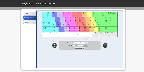
You can now try out a preview version of the new Keyboard Layout Analyzer. I completely re-did it from scratch. I know I’ve done that before, but I’ve learned a lot about JavaScript and HTML5 over the past two years and thought the application would be best served with a fresh start. Below you can see a screen capture of the new configuration page.

Configuration Tab

The biggest problem with the previous Analyzer was that it didn’t have the best configuration options. And even then, the top-based tab interface led to a lot of people not even noticing that configuration options existed. My main goal was to make configuration much more intuitive and flexible.

The previous Analyzer also assumed keys to be atomic and wouldn’t let you mix and match characters from different keys. For English keyboards this was mostly fine, but when I started learning about Foreign layouts and specialized layouts like the Programmer Dvorak, I realized I’d made a fatal mistake. The old code centered around atomic keys and even used image icons for the configuration display. For this version, I decided to draw the keyboard on a canvas element and to allow keys to mix and match characters. Theoretically, the new setup could even analyze unusual layouts like the Maltron layout, but I haven’t yet created Keyboard Maps for that layout, nor have done much testing in that area (though it’s a goal).

I also tried to make the app look more visually appealing and to provide a better user experience. The old layout was kind of amateurish looking, a number of people didn’t utilize the top-based tabbed interface, and the amount of scrolling you had to do on the output page made it easy to miss interesting information – not to mention that I was using pie charts, which are notoriously bad at presenting this type of information (I had a decent number of people email me asking me to switch to bar charts). I tried my best at making something that was reasonably ok looking, and I hope the new side-tabs making navigating the information easier.

I’ve recently taken on a lot at work, so that has slowed me down quite a bit, but I hope to finish off the rest of the output sections in the coming month. If you find any bugs or have any suggestions please let me know!

Is ___ more of a boy’s name, or a girl’s name?

Photo By Zach Klein

So my boss came into my office on Friday and off handily asked me if “Stacy” was more of a boy’s name, or more of a girl’s name. I immediately thought “piece of cake!” and brought up my Baby Naming Trends Tool, only to be really confused that there was no feature for determining this. “Wait, I remember programming this feature last Fall, where is it?” I thought. Then I remembered I had waited to push the update out until I finished a couple of other features (which remain unfinished). D’oh!

Since male vs female feature was kind of fun, I decided cut out the unfinished functionality (for now), and push out the update so users could query the data. Now you can see if names are more popular for girls or for guys. Just place a “m:” or “f:” before a name when you enter it in. Here are some examples of names commonly given to both boys and girls:

  • Casey – Very close, more male leaning though.
  • Jordan – More male leaning.
  • Mackenzie – More female leaning.
  • Pat – A nick name, but popular with female babies in the 30’s and 40’s (though it’s almost no longer used). Patrick and Patti are more popular.
  • Quinn – More female leaning.
  • Riley – More males, but trending towards more females.
  • Stacy – More female leaning.
  • Taylor – More female leaning.

However, when creating this feature, I noticed some interesting abnormalities. No popular names seemed to be 100% male or female, even names that were obviously male or female. For example, according to the data, 11 females were named John in 2010, and during its peak popularity, when 80,000 males a year were being named John, the data says 200-300 females a year were being named John. Even though that means only ~0.375% of John’s were female, it still seems bizarre that someone would name a baby girl “John”. I wondered if this was a mistake on my part, but the underlying data showed the numbers to be correct.

The idea that someone would give a baby girl or boy a name of the opposite sex isn’t too far fetched, I know a few guys with names more commonly associated with girls, but are there really hundreds of guys named Jennifer walking around in the US? I accept that there may be a hand full, but my guess for the real reason this anomaly appears is because nurses or doctors sometimes make mistakes when recording the data. That makes me a little sad, but I suppose any data that’s hand recorded is going to have some errors. Though if this is the case, since this data comes from the US Social Security website, does this mean that these people may have their sex incorrectly recorded on their birth certificate? Though then again, perhaps people give a name for their baby, but then change it when it’s born and they find out it’s a different sex. Or then again, maybe there are lots of male Jennifers out there. Whatever the case, it makes for an interesting blip in the data.

Keyboard Layout Analyzer Update

I’ve rewritten the Keyboard Layout Analyzer. Back in November I told a guy I was close to being done and would have a new version up in “2 weeks”. I then told two other people in December who asked for additional features that I’d have it up in “2 weeks”. I now feel a little bit like a jack ass, but I honestly have been really busy. My new plan is to simply put up a preview version soon. The new app is mostly done, but rough around the edges in the output department.

Extendible BBCode Parser in JavaScript

Photo By Dean Terry

I decided to try my hand at implementing a BBCode parser in JavaScript. You can play around with it online here, and download the source here.

I had looked around a little bit and noticed that the existing JavaScript BBCode parsers had at least a few of the following issues:

  • They didn’t report errors on misaligned tags (e.g., [b][u]test[/b][/u]).
  • They couldn’t handle tags of the same type that were nested within each other (e.g., [color=red]red[color=blue]blue[/color]red again[/color]). This happens because their regex will look for the first closing tag it can find.
  • They couldn’t handle BBCode’s list format (e.g., [list][*]item 1[*]item 2[/list]).
  • They didn’t report errors on incorrect parent-child relationships (e.g., [list][td]item 1?[/td][/list]).
  • They weren’t easily extendible.

I naively thought it’d be easy to quickly whip up a parser, and at first it was. Most BBCode tags can be implemented with a simple find and replace. However, I quickly ran into the issues of dealing with nested tags of the same type, the noparse tag, and the list tag’s annoying [*] tag (which doesn’t have a closing tag). Luckily, I came across a neat blog post on finding nested patterns in JavaScript, which came in handy for isolating tag pairs, from the inner-most on up. Taking the idea from that post, one can do something like this to process the inner tags first and avoid the nested tag problem:

var str = "[list][list]test[/list][/list]",
    re = /\[([^\]]*?)\](.*?)\[\/\1\]/gi;
while (str !== (str = str.replace(re, function(strMatch, subM1, subM2) {
    return "" + subM2 + "";
})));
// str = "test"

That idea works well, though you can’t implement a noparse tag if you process the inner-most tags first. So I decided to pre-process the BBCode with something similar to the idea above and add in nested-depth information to each open and close tag. Once all of the tags had that, I could parse the processed code with a regex that could easily match-up the correct open and close tags.

To get around the issue of the [*] tag having no closing tag, I wrote code that inserted [/*] tags where they were supposed to go during the pre-processing period. I wont go into the algorithm here, but you can dig into the code if you’re interested.

Also, I should note that the fact that JavaScript allows you to use a function as the second parameter to the replace method makes processing the tags really easy. Once you match a set of tags, you can recursively call the parse function on that tag’s contents from inside of the function you passed to replace.

Using the parser

To use the use the parser, you’d simply include xbbcode.js and xbbcode.css files somewhere on your page (which are contained in the zip file linked above), and then call the XBBCODE object from somewhere in your JavaScript:

var result = XBBCODE.process({
    text: "Some bbcode to process here",
    removeMisalignedTags: false,
    addInLineBreaks: false
});
console.log("Errors: " + result.error);
console.dir(result.errorQueue);
console.log(result.html);// the HTML form of your BBCode

Adding new tags

To add a new tag to your BBCode, add properties to the “tags” object inside of the XBBCODE object. For example, say you wanted to add a tag called [googleit] which would change its contents into a link of its google search results. You’d implement that by adding this to the tags object:

"googleit": {
    openTag: function(params,content) {
        var website = "\"http://www.google.com/#q=" + content + '"';
        return '<a href=' + website + '>';
    },
    closeTag: function(params,content) {
        return '</a>';
    }
}

Then you could have BBCode like this: “[googleit]ta-da![/googleit]” which would be transformed into this: “<a href=”http://www.google.com/#q=ta-da!”>ta-da!</a>”

If you have any suggestions or find any bugs let me know.

JavaScript Parallax Scrolling Experiment

Parallax Clouds at patrickgillespie.com

There’s a neat CSS technique called “Horizontal Parallax Scrolling”, where background images will move at different horizontal speeds when the window is resized (example). It’s done by positioning several divs on top of each other and having their background-position property set to different offsets. You can read a great CSS tutorial on it here.

I thought it was kind of cool and decided to see if I could come up with a way of doing “Vertical Parallax Scrolling”. There are a lot of ways one could approach this, but I decided to go with fixed positioned divs that would move when the user scrolled the page up and down. These divs would be attached to the background and a content div would sit on top of the background which would have a z-index higher than any of these fixed positioned divs. All content for the page would go inside of this content div. I figured this approach would suit me well since I was thinking of creating something where there’d be lots of floating objects in the background.

After playing around a bit I came up with something that worked reasonably well in IE7+, Firefox and Safari, and ok-ish in Chrome. The effect was neat and 3D-ish, so I decided to use it at patrickgillespie.com. It replaces the silly CD cover experiment I’d previously hosted there. The effect is still not as smooth as I’d like it, but I think for a really nice smoothness I’d probably have to use a canvas element instead of a bunch of divs. Anyway, if you’re interested, I’ve put together an example which you can download here.

Your Security Software May Be Unnecessarily Slowing Down Your Internet Experience

One easy way a webmaster can speed up their website is by enabling gzip compression on their web server. Most major websites do this and all modern browsers support receiving gzip encoded content. Sending out gzipped components greatly reduces the size of the response a web server sends to the browser and leads to the user having a faster experience with the website.

1 out of 5 US users don't take advantage of gzip compression on the web
Original Photo By allyaubry

Despite this being a plus for everyone, according to the book Even Faster Web Sites,around 20% of US users do not experience this enhancement. The number goes down to 15% when a world wide audience is considered, but that’s still a decent number of web surfers. The book states that the culprits behind the slowing down of the net for 15% of its users fall into two main categories:

  • Web Proxies
  • Computer Security Software

The reasons for this are that the above want to observe the responses from the web server and don’t want to have to decompress the files, so they either remove or mangle the “Accepts-Encoding:gzip” message that your browser sends to the web server. This leads to the web server thinking that the browser doesn’t support gzip compression, and therefore it sends back uncompressed data. The reason for mangling or stripping away the “Accepts-Encoding:gzip” message may have been to try and minimize the number of CPU cycles needed to examine data from the web server, but increasing download time to get around decompressing data is a poor trade off.

Many newer security software suites have since rectified this problem, but there are still some out there that unnecessarily hamper your web surfing. You can check and see if you’re apart of the 15% of people who don’t recieve gzipped data by going to the following link: Gzip Compression Test Page

Photo By alumroot

I’m writing this entry mainly because I’m doing a lot of front-end optimization at work and I ended up discovering that I was in the unfortunate 15% of web users who were missing out on a faster web experience. I also found out that my parents were in the same boat. If you click the link above and discover you are also not benefiting from gzip compression on the web, it’s worth temporarily disabling your security software and seeing if it is the cause of your problems. If you are unable to isolate the problem to software on your computer, it may be a web proxy which is removing/mangling the “Accepts-Encoding:gzip” message, and if that’s the case, you’re pretty much out of luck unless you control the proxy.

If you isolate the problem to your security suite, I would either try upgrading the software or switching to a different service. I dual boot my machine with Windows and Linux (my problem was only on Windows) and for Windows I’ve currently switched to using Microsoft’s Security Essentials for my virus checker (along with SpyBot), which LifeHacker seems to think is good enough, though I’m currently still researching the best tools to use.

If you are a webmaster and are interested in enabling gzip compression, you can find an easy-to-follow tutorial on how to do it here. If you want to go a little further down the rabbit hole, Yahoo! has put together a very nice list of techniques you can use to speed up your website.